Progress Tracker UI: 7 Examples for Coaching Platforms

Coachful

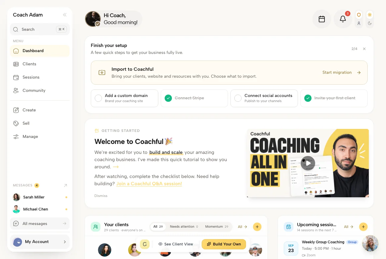
A coach opens a client dashboard on Sunday evening and sees a progress bar that is technically moving, but still feels ambiguous. Is it encouraging, or is it a quiet reminder of everything that's missing? Common concerns show up fast. Will clients feel judged? Will this become another thing to maintain? Will the data change how I coach, or just make the screen look busier? The seven progress tracker UI examples below answer those questions with concrete patterns for dashboards, goal timelines, rings, and habit trackers, plus the trade-offs that matter in a coaching practice. If you want to see the kind of product experience these patterns support, watch the product demo.
1. MUI for branded dashboards that still need a real system
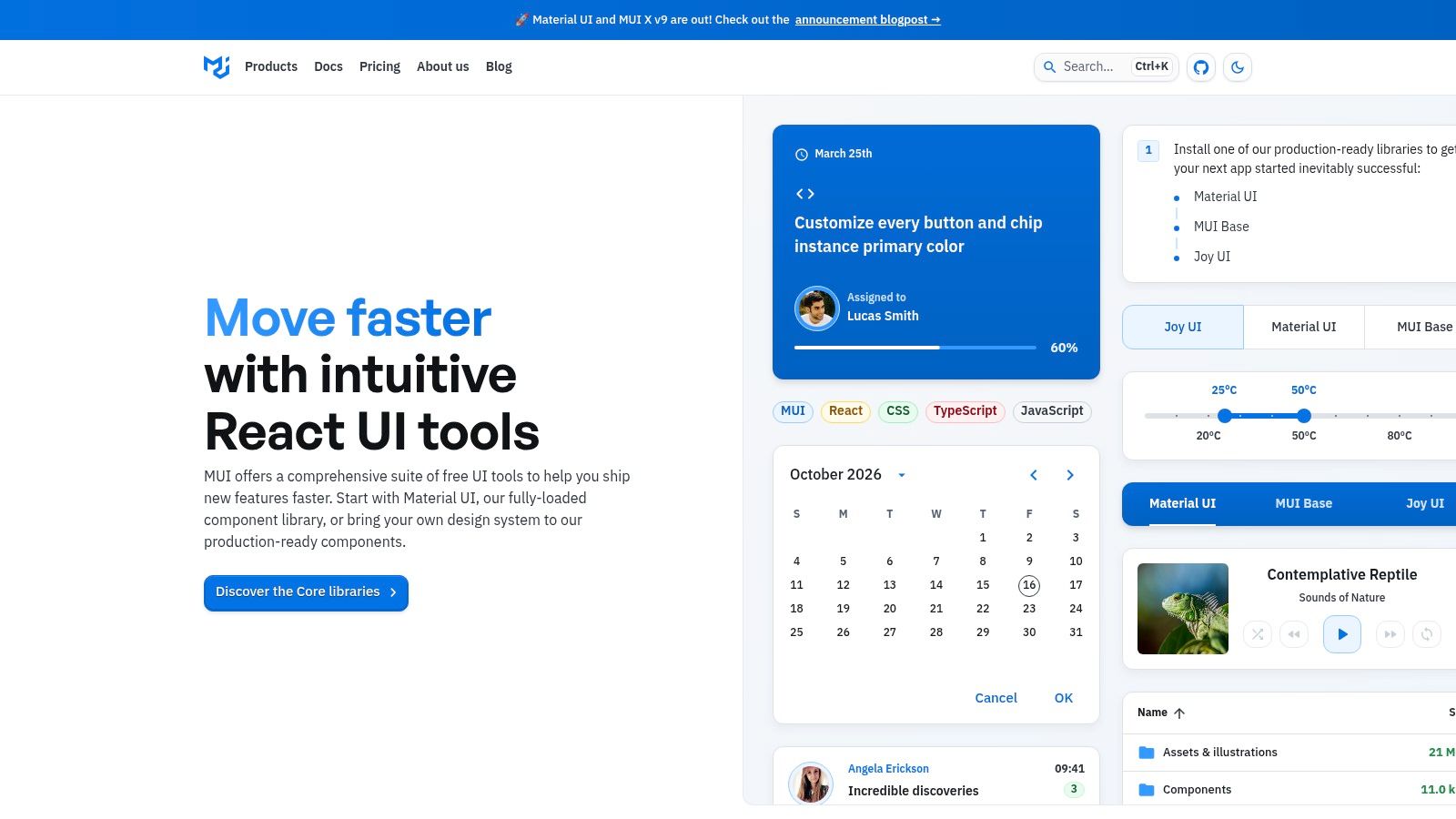
MUI is the safest choice when a coaching platform needs a progress UI that behaves well across screens and still feels like part of a broader product system. Its LinearProgress and CircularProgress components cover simple status states, while Stepper handles multi-step flows cleanly, which matters when a coach is moving a client through onboarding, milestones, or session prep. The best reason to pick it is not style alone, it's the combination of documentation, theming, and enough structure to avoid inventing your own tracker from scratch. For a coaching product, that usually means less time arguing about component behavior and more time deciding what the client should see. MUI fits that use case well, and the branded setup can sit alongside a deeper coaching article like How to Track Progress.
Where MUI works and where it slows teams down
The strength is flexibility without rebuilding basics. Determinate and indeterminate states let you show both “working” and “moving toward a target,” while theming lets you keep milestone colors consistent across the dashboard, notes, and schedule views. The trade-off is setup time, especially if you want a highly branded surface instead of a default enterprise look.
Practical rule: If the coach asks, “Can the client read this at a glance?” MUI usually passes that test faster than a custom build.
The setup cost becomes more visible when the team starts layering in advanced charting or data-heavy modules. That's where a progress tracker can drift from helpful to fussy if the design isn't disciplined. For coaching flows, MUI is strongest when the tracker stays close to the question the coach already has in mind, what changed, what's left, and what's the next action.
2. Ant Design for structured milestones that feel operational
Ant Design is a strong fit when the coach needs the tracker to feel like a sequence, not just a meter. Its Steps component is good for onboarding, program milestones, and client journeys where the sequence itself matters as much as the final completion state. The Progress component gives you line, circle, and dashboard shapes, which makes it easier to show a client both broad status and a tighter milestone view in the same product family. The catalog is broad enough that teams can pair a tracker with result states, uploads, and other workflow components without leaving the system. Ant Design also pairs naturally with a program dashboard like Coachful's program management dashboard.
Why it helps coaches, and why it can feel opinionated
The upside is obvious when you're building a client journey with clear states. A coach can show “invited,” “active,” “submitted,” and “reviewed” without stitching together several different patterns. That clarity helps when the client asks whether they are moving forward or just accumulating tasks.
The downside is equally clear. Ant Design has a strong visual identity, so teams often need token work to make it feel like their brand instead of Ant's default enterprise language. It can also feel heavier than necessary if the only thing you need is a compact habit tracker.
The right test is simple, if the tracker needs to explain process, Ant Design does that well. If it only needs to show quiet status, it may be more component than you want.
For coaching products, that distinction matters. A client doesn't want to feel processed. They want to know what happens next, and Ant Design is better at that than many systems that treat progress as a decorative side panel.
3. Radix UI when accessibility and visual control both matter
Radix UI is the cleanest choice when the team wants to control every pixel of the progress experience without losing accessibility semantics. Its Progress primitive is unstyled, which sounds limiting until a design team realizes how much freedom that gives them in a coaching dashboard. You can build a tracker that looks like a timeline, a compact bar, a status strip, or a custom milestone rail, and still keep the underlying behavior grounded in proper ARIA structure. Radix UI is strongest when the product team already knows the brand language and wants the UI to disappear behind it.
The trade-off is build effort, not capability
Radix is not the fastest route if the coach needs a progress view next week. It gives you a primitive, not a finished coaching pattern, so the product team has to assemble the surrounding logic, labels, and states. That's the price of control.
For a coach, that can still be the right move. A highly sensitive client dashboard often needs non-standard messaging, like “on track,” “needs attention,” or “waiting on review,” rather than a generic percentage. Radix makes that possible without forcing a rigid stepper shape.
Practical rule: Use Radix when your progress tracker needs to look custom but still behave accessibly under the hood.
It's especially useful when visual density matters. A coach who wants to see habit logs, milestone notes, and one summary status line can get all three into a narrow layout without the interface feeling crowded. The UI work is heavier, but the result can feel much closer to a real coaching system than a stock component library.
4. Chakra UI for fast integration with good defaults
Chakra UI sits in the practical middle. It gives teams Progress and CircularProgress components with good defaults, while keeping theming simple enough for a small product team to ship quickly. For a coaching dashboard, that usually means less friction when building the first useful version of a tracker. The documentation is clear, the component API is consistent, and the design tokens make it easier to keep the tracker aligned with the rest of the app. Chakra UI also works well when the product needs to grow into a broader dashboard later.
Good for teams that want less ceremony
A coach doesn't care whether the tracker was elegant to implement. A coach cares whether the client opens it, understands it, and comes back to it between sessions. Chakra is useful because it gets to that point quickly, especially for simple progress bars, round indicators, and status readouts.
The downside is that multi-step coaching flows need composition. There isn't a native Steps component in core, so the team has to stitch together a wizard or milestone flow with other pieces. That's manageable, but it does add design and implementation responsibility.
A useful way to think about Chakra is as a strong default rather than a specialized progress system. If the client just needs a visible path, a round tracker, and a few labels, it's efficient. If the coaching product needs a more narrative sequence, a richer library may fit better.
5. Bootstrap for simple client portals that don't need much JavaScript
A coach portal that only needs a completion bar, a status line, or a few stacked segments does not need a heavy UI system. Bootstrap fits that job well. It drops into plain HTML, Rails, Django, or PHP with little setup, and its progress bars already cover striping, labels, animation, and stacked segments. That keeps the first version moving without extra component work. Bootstrap is also familiar, which helps when the team wants clarity more than a distinctive visual language.
Simple is the point, and that sets the limit
Bootstrap works cleanly for narrow questions. Is the profile complete? Is onboarding done? Has the module been finished? Those are the kinds of progress checks it handles well.
If the portal only needs a visible bar, Bootstrap keeps the build light. The moment a multi-step coach workflow appears, the team starts assembling the rest of the experience from separate UI pieces. The limited scope is the trade you accept for minimal JavaScript and broad browser support.
That makes sense for coaching products where upkeep matters. A recognizable default can be fine if the tracker stays simple and the brand can tolerate some standard Bootstrap styling. A more custom look takes extra theming, so the design team has to decide whether that effort is worth it.
A coach who wants fewer moving parts will usually prefer Bootstrap over a richer design system when the requirement is just a simple progress view. The product risk is overusing a basic bar and expecting it to do more than it can. It can show completion or a small set of segments. It cannot answer deeper coaching questions on its own.
6. Flowbite when you want a progress tracker that matches Tailwind speed
Flowbite makes sense when the team already uses Tailwind and wants a progress pattern fast. Its Progress and Stepper components are ready-made for onboarding, course modules, and client programs that move through clear stages. The visual defaults feel modern, and because customization is utility-based, it's easy to keep the tracker aligned with the rest of the product without redesigning every state by hand. Flowbite also pairs naturally with a practical progress tool like Coachful's progress tracker.
Fast implementation with a real design payoff
The main advantage is speed. If your stack already speaks Tailwind, you can move from concept to usable tracker quickly and still keep enough control over spacing, color, and emphasis. That matters in coaching products, where a tracker often starts as a basic milestone view and grows into something more operational.
The trade-off is dependency. Flowbite expects Tailwind, so teams outside that ecosystem will feel friction. Some more advanced blocks also sit behind the Pro tier, which can complicate planning if the product roadmap changes later.
For coach-facing UI, Flowbite's stepper is especially useful when you need a client to understand “where am I, and what's next?” without staring at a dense dashboard. It's a good fit for onboarding sequences, curriculum completion, and habit-based programs where the visual language should stay clean and current.
7. Kendo UI for enterprise coaching tools that need vendor-backed consistency
Kendo UI fits teams that need a commercial suite with long-term support and consistent APIs across frameworks. Its ProgressBar and Stepper components work well for coaching platforms with multi-step flows, enterprise documentation, and vendor-backed stability. In larger coaching organizations, mentoring programs, or academies, the same tracker often has to hold up across several product surfaces. Kendo UI prioritizes dependable execution over novelty.
When support is part of the buying decision
The practical appeal is straightforward. Teams get demos, docs, and a commercial support path, which lowers uncertainty when the tracker becomes part of a larger system. For a coach-facing product, that often means fewer compromises when the same behavior needs to hold across Angular, React, or another stack.
Cost and tone are the two things to weigh before committing. Kendo reads more enterprise than boutique, so most coaching brands will need retheming to avoid a rigid default look. It also asks for a heavier investment than open source libraries, which only makes sense if the platform needs that support model.
If the question is “Will this survive long-term growth?”, Kendo deserves attention. If the question is “Can we ship a coach dashboard quickly?”, it may be more than you need.
In an academy running cohorts across several product surfaces, the same Stepper behavior everywhere keeps the client experience coherent. A progress tracker in a coaching platform often becomes a trusted operational surface, not a decoration. Kendo is built for that responsibility.
Top 7 Progress Tracker UI Comparison
| Library | Implementation Complexity 🔄 | Resource Requirements ⚡ | Expected Results / Impact 📊 | Key Advantages ⭐ | Ideal Use Cases 💡 |
|---|---|---|---|---|---|
| MUI (Material UI) | Medium, ready components; deep theming increases setup | Moderate, React, theme tokens; MUI X paid for advanced data components | High, polished progress controls, accessible steppers, consistent branding | Enterprise docs & ecosystem; strong theming; wide adoption | Branded coaching dashboards, multi-step wizards, enterprise apps |
| Ant Design | Medium, batteries-included but opinionated styling may need tweaks | Moderate–High, React, larger bundle if many components; token customization | High, versatile Progress shapes and robust Steps with examples | Rich component catalog; batteries-included multi-step patterns; strong docs | Structured onboarding, milestone tracking, enterprise dashboards |
| Radix UI | Low–Medium, small primitives are simple, full patterns require assembly | Low, tiny primitives, framework-agnostic styling, minimal bundle | High, fully custom visuals with a11y-first semantics when designed | Maximum styling control; composable and accessible primitives | Custom-styled dashboards, design-system primitives, accessibility-first UIs |
| Chakra UI | Low, good defaults and ergonomic APIs; steppers must be composed | Low–Moderate, React, theme tokens; optional Pro paid blocks | Good, fast to theme, accessible defaults for progress indicators | Fast theming & developer ergonomics; clear accessibility defaults | Rapid dashboards, program progress indicators, teams valuing DX |
| Bootstrap | Low, CSS-first, drop-in progress bars with minimal JS | Low, CSS toolkit (works in any stack); React wrappers available | Moderate, reliable, broad browser support but distinct default look | Simple to implement; huge ecosystem; minimal JavaScript required | Lightweight client portals, marketing sites, multi-stack projects |
| Flowbite | Low (if Tailwind present), ready components and steppers | Low–Moderate, requires Tailwind setup; optional Pro library | Good, modern defaults, quick step-based flows with utility customization | Tailwind-ready kit; quick stepper implementations; clean defaults | Tailwind projects, onboarding flows, course/module trackers |
| Kendo UI (Telerik) | Medium, enterprise-ready components across frameworks | High, commercial license; framework-specific packages and support | High, robust ProgressBar/Stepper with vendor-backed support | Enterprise support; consistent APIs across frameworks; extensive demos | Enterprise applications needing vendor support and multi-framework consistency |
Choosing the Right Progress Pattern for Your Coaching Practice
The best progress tracker UI is the one that answers the coach's real question without creating a new problem. Sometimes the question is, “Will clients open this between sessions?” Sometimes it's, “Will this feel like judgment?” Sometimes it's just, “How much upkeep will this need from my team?” Start with the simplest pattern that answers that question, not the richest library on the shelf. A compact bar or stepper often does more work than a polished dashboard full of competing signals.
The design choice gets clearer when you look at the coaching behavior behind it. Research on progress monitoring found that prompting people to record progress was associated with better goal pursuit, and that more frequent monitoring strengthened the effect (APA summary of Harkin and colleagues). Research on quantifiable goals also found that measurable goals were more likely to be compared against a target, with an odds ratio of 2.41 (goal monitoring study). That means the UI should make recording easy, understandable, and routine, not just visually attractive.
The coaching question I'd ask first is simple. What does the client need to see to act? If the answer is a next step, use a stepper. If the answer is a measurable trend, use a bar or ring. If the answer is “what happened since last session,” use a timeline or milestone log. Then test it with one real client for two weeks and check whether they return to it between sessions. A tracker that no one revisits is usually too complex, too judgmental, or too disconnected from the work.
Pick one pattern from this list, sketch its states for on track, behind, and complete, and decide who updates the data. That simple decision usually reveals whether the UI is a coaching tool or just a reporting layer. If you want help turning that decision into a working product flow, Hire Developers can be the next step, and Coachful can serve as a practical reference for how progress, goals, and client visibility fit together in one system.
Coachful brings progress tracking, goals, milestones, session notes, and client sharing into one coaching workspace. If you're designing a progress tracker UI for clients, programs, or cohorts, visit Coachful and see how it handles the workflow in practice.