
How to Prepare Slide Decks That Actually Land

Coachful

You're staring at a blank deck again, and the problem isn't that you lack ideas. The problem is that you've got too many, and your brain is trying to turn every thought into a slide. That's exactly how coaches end up with decks that feel busy, defensive, and hard to trust, even when the content itself is solid.
The fix starts with a blunt shift in mindset. How to prepare slide decks well is not a design question first, it's a coaching decision. You're deciding what the room should think, feel, and do after each slide, and if you skip that decision, no font choice or template will save you.
The Real Reason Slide Prep Feels So Hard
Most coaches don't freeze on slide prep because they're bad at PowerPoint or Keynote. They freeze because they're trying to answer five questions at once, while also making the deck look polished enough to survive scrutiny from a client, sponsor, or peer. That's why the blank canvas feels weirdly personal.
Confusion often arises because many treat slide preparation like a design task, when it's a sequence of decisions. What point belongs here? What does the client need to believe? What action should happen after this slide? Once you answer those, the visual part gets much easier because the slide has a job.
One-off talks and coaching programs need different logic
A one-off talk can be built around a single reveal. A coaching program deck has to carry people across multiple touchpoints, which means it needs continuity, reuse, and a tighter relationship to client experience. If you copy generic presentation advice into a coaching deck, you'll often get something pretty and useless.
The audience also changes the work. In a workshop, you're helping people understand and remember. In a program kickoff, you're building trust and momentum. In a stakeholder update, you're protecting credibility and making the next decision easier.
Practical rule: If you can't say what a slide changes in the room, it doesn't belong in the deck.
That's the standard. Not “Does this look complete?” Not “Did I include all my notes?” The only useful question is whether the slide moves the conversation forward.
Locking In Purpose Audience and Desired Outcome
Before you open a slide tool, you need three answers. Who's in the room, what decision should they leave with, and what action should they take within 24 hours. If you skip those three, you'll build a deck that sounds broad and lands nowhere.
Use a short intake brief before you touch layout. Write the audience, the decision, and the next step in plain language, then pressure-test every slide idea against that brief. If a slide doesn't support the decision, cut it. If it only repeats what the audience already knows, cut it. If it sounds impressive but doesn't move action, cut it.
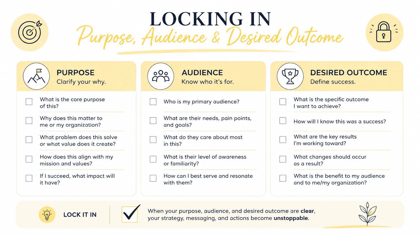
A reusable intake brief you can copy
- Audience: Who is in the room, and what do they already know?
- Decision: What should they decide, agree to, or understand by the end?
- Action: What should they do within a day of seeing the deck?
- Constraint: What would make them resist, dismiss, or ignore the message?
That brief works across coaching formats. For a discovery call, the outcome might be that the prospect can tell whether the offer fits. For a group program kickoff, the outcome might be that participants know how to start strong and what matters first. For an HR or L&D pitch, the outcome might be that the sponsor knows why the program deserves support and what success will look like.
A useful way to think about this is to draft the slide promise before the slide itself. “By slide five, the prospect knows whether group or 1:1 fits them” is sharper than “Explain my coaching program.” One is a decision. The other is a fog machine.
Start with the decision, not the content. Content without a decision is just a pile of nice-sounding fragments.
For a sharper planning framework on workshop buildout, this step-by-step tutorial approach is a good companion when you're mapping the path from intent to deck.
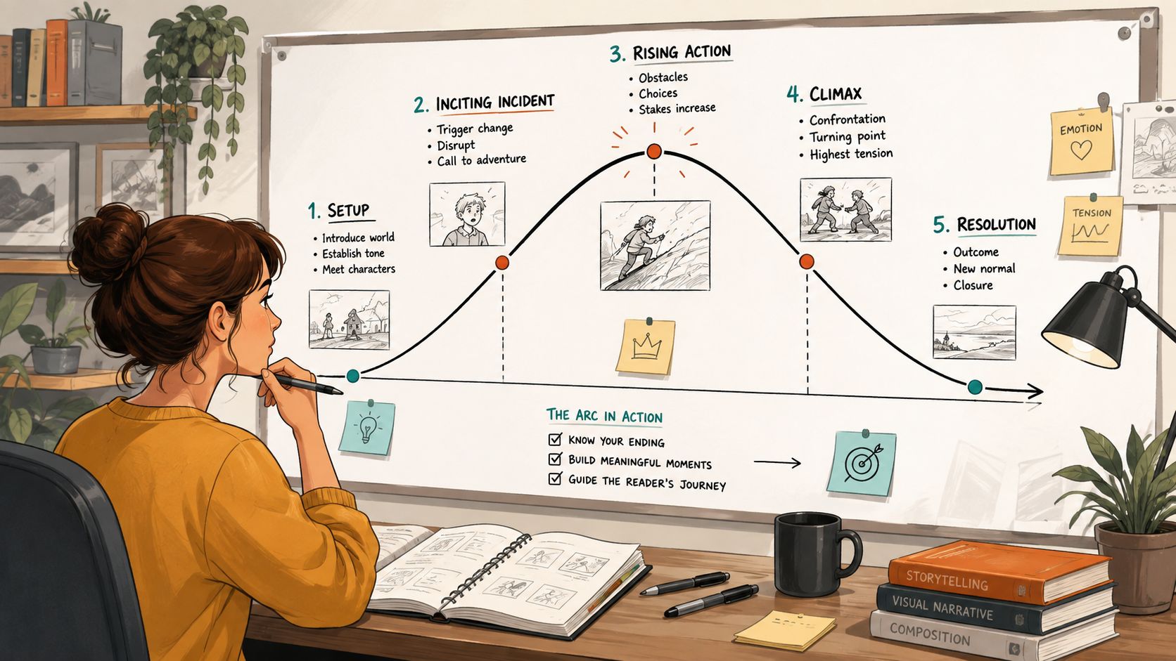
Building the Story Arc Before You Touch a Layout
One coach fills slides in the order she ran the sessions. Another builds the deck around the client's decision journey. The first deck feels chronological. The second one feels useful.
The stronger option starts with a story spine. MIT's slide guidance pushes you to build from motivation, methods, results, and impact, and to turn each sentence into a slide title so the deck reads like a narrative, not a logbook. That same logic works beautifully for coaching decks, because clients and sponsors don't care about your internal workflow nearly as much as they care about what changed and why it matters. MIT's slide structure guidance makes that point clearly.
Two coaches, two very different decks
Coach A opens with “Session 1,” then “Session 2,” then “Session 3.” It's tidy, but it asks the audience to follow her calendar. Coach B opens with the problem, moves to the intervention, then shows what shifted and what comes next. That deck respects the room's attention.
The difference shows up in slide titles. “Results” is lazy. “Clients improved consistency after weekly check-ins” tells the room what the slide proves before they read a word. That matters because strong titles carry the argument even when someone skims the deck later.
A clean coaching story usually fits into 2 to 4 thematic blocks. Don't force every detail into one arc, and don't wander across eight mini-topics because you're afraid to leave anything out. Group the slides by what they prove, not by when you produced the material.
Read the titles only. If the deck still makes sense, the structure is working.
That test saves time. It also exposes filler immediately. If the title list feels like a file folder, you've got a chronology problem. If it feels like a case for action, you're on track.
Designing Slides That Don't Fight the Message
Design isn't decoration. It either helps the client think, or it steals attention from the point. There's no neutral middle ground.
The simplest rule is the best one, one idea per slide. That rule is reinforced across presentation guidance that warns against cognitive overload and recommends limiting the audience to roughly 3 to 5 key takeaways per slide set, not per slide, because too much competing information makes the main point harder to hold in mind (SlideModel's presentation guidance). For data-heavy slides, the headline insight should come first, charts should replace raw tables, and formatting should stay simple so the number is readable fast (New York State health presentation tips).
Use design limits that keep the room awake
- Title size: Aim around 30 to 48 points so the headline can carry the slide.
- Body size: Keep body text around 24 to 28 points when the room needs to read it quickly.
- Line count: Stay under 6 lines of text.
- Line length: Keep it to 6 words per line.
- Format: Use the 16:9 ratio, a simple palette, strong contrast, and whitespace.
- Focus: Use one accent color, not a rainbow.
Those limits are blunt on purpose. A slide titled “Program Overview” with five dense bullets looks cautious, but it usually reads as unfocused. A better version is “Week 1, Goal Setting,” with one simple diagram and one callout line. The slide doesn't need to explain everything, it needs to make one point obvious.
This is also where coaches often design for the wrong audience. They build slides to impress other coaches, not to be read from the back of a workshop room or on a dim projector. If the person in row nine can't catch the point in a few seconds, the slide is overdesigned for the wrong crowd.
For teams that also need polished landing pages to match the professionalism of their decks, landing page design services are worth studying because the same discipline applies, clean hierarchy, tight copy, and zero junk.
Writing Copy That Sounds Like a Coach Not a Brochure
Slides fail in the words more often than they fail in the visuals. Coaches love vague lines because vague lines feel safe, and they sound polished until a client's eyes slide right past them.
Strong slide copy has three layers. The headline says the point. The supporting line gives the context. The call-to-action tells the room what happens next. If any of those three are mushy, the whole slide feels like marketing copy that forgot who it was talking to.
Rewrite the three most common coaching slide types
A discovery-call opener should sound direct. “Our approach is comprehensive and impactful” becomes “We'll see whether your goals fit a 12-week coaching structure.” That sentence is plain, honest, and useful.
A group-program benefit slide should name the actual shift. “Build confidence and consistency” becomes “Clients get a weekly rhythm, peer accountability, and a clear next step after every session.” That's stronger because it tells the buyer what the experience feels like, not just what the offer claims to be.
A progress-checkpoint slide should respect the client's intelligence. Don't say “You're making great progress.” Say what changed, what still needs work, and what the next move is. If you can quote a client result accurately, use it. If you can name the exact number behind a claim, name it. If you need to re-engage the room, ask one sharp question, not five.
If you're shaping slide copy alongside a broader sales narrative, the sales page template resource is a useful mirror because the same principle applies, clarity beats cleverness every time.
Blunt rule: If the line would work on a brochure, it's probably too soft for a slide.
That doesn't mean your copy has to be sterile. It means it has to earn the client's attention. A coach's voice should sound like someone who knows what happens next, not someone trying to sound important.
For visual identity work that supports this kind of clear messaging, branding for B2B service sites is a good reminder that clean systems beat decorative noise when the goal is trust.
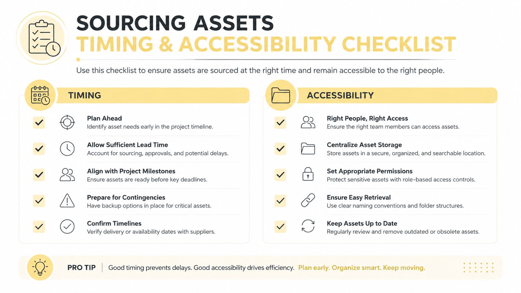
Sourcing Assets Timing and Accessibility
A deck can look polished on your laptop and fall apart the moment it hits a projector, a mobile screen, or a screen reader. That's not a design failure, it's a preparation failure.
The safest move is to treat assets like a checklist, not a scavenger hunt. Use images you can legally use, test contrast before you present, and write alt text for anything a visually impaired client needs to understand. If a slide relies on a visual, the visual needs a role, not just decoration. The slide prep guidance on avoiding bubbles, dirty slides, uneven smears, and other practical failures makes the same point in another context, quality control matters as much as the basic workflow (slide preparation troubleshooting notes).
Side by side choices that save you later
| Decision | Better choice | Why it works |
|---|---|---|
| Images | Licensed stock or your own screenshots | Fewer legal and quality surprises |
| Text contrast | Dark text on a light background, or the reverse with strong separation | Keeps the slide readable under bad room lighting |
| Slide timing | One clear point per slide, not a long pile-up | Keeps the audience with you |
| Speaker notes | One point, one story, one question | Stops you from rambling |
If you need a rule for timing, use about one minute per slide as a rehearsal target. That's not a script. It's a pacing check. If you keep drifting past it, the slide is probably doing too much work or your verbal delivery is carrying material that belongs on the slide itself.
The asset checklist should include image license, alt text, contrast pass, slide timing, and a speaker-note prompt. That sounds boring because it is boring, and boring is good when the consequence of skipping it is a broken deck. A coach presenting outcome data to an HR sponsor can't afford to freeze when someone asks, “How do you measure ROI?” The answer has to be rehearsed before the room asks.
For coaches who also deliver video-based resources, plan a product demo video is a useful parallel because timing, clarity, and asset discipline matter there too. The same kind of planning prevents bloated delivery in both formats.
The pre-flight routine that keeps you calm
- Cold read: Go through the deck once without stopping.
- Timing pass: Check whether any slide drags.
- Question rehearsal: Practice the two hardest questions out loud.
- Weak-slide cut: Remove anything that doesn't earn its keep.
That pass is where confidence comes from. Not from perfect slide art, from knowing the deck can survive contact with a real room.
Exporting Sharing and Delivering the Deck
A deck doesn't end when the presentation ends. Coaches lose value when they treat export like an afterthought, because the file format determines whether the deck becomes a handout, a self-paced resource, or a reusable program asset.
Send the format that matches the job. PDF works best when people need a clean handout. An export with speaker notes helps when learners will revisit the material later. An editable file is useful when a client needs to adapt the content for their own team. If the deck will live inside a structured coaching environment, it should be embedded where people already work, not buried in an email thread.
The operational details that quietly matter
File names should be boring and clear. Version control should make it obvious which deck is current. And the one-page summary slide should do real work, because that's the slide people open later when they don't want to scan the whole presentation again.
The deeper point is delivery discipline. If you're going to present, send a version before the session if the audience needs context, then send a cleaner follow-up after the session if they need to review. That way the deck supports the conversation instead of replacing it.
A short presenter-notes format keeps you steady:
- The one point. What does this slide prove?
- The story. What example or transition will you say out loud?
- The question. What will you ask the room if they go quiet?
That structure matters because rehearsal is where slide prep happens. A 30-minute pre-flight is enough for a cold read, a timing pass, a question rehearsal, and a weak-slide cut. If you're presenting in a coaching context, that rehearsal is also where you learn how to recover when a slide doesn't land perfectly, and that's not a disaster. It's visible coaching.
For a practical reminder on handling file weight and delivery friction, how to make videos a smaller file size is a decent complement when your deck includes rich media and you don't want upload or playback issues to wreck the flow.
The final rule is simple. Your slides are only as good as the moments between them. If the transitions are clear, the timing is tight, and the export matches the use case, the deck feels deliberate instead of improvised.
If you want a coaching platform that helps you keep decks, notes, resources, and follow-up materials in one place, visit Coachful. It's built for coaches who want their client experience to stay organized before, during, and after the session. Use it when you're ready to turn slide prep into part of a real coaching system, not a last-minute scramble.