Your High-Converting Sale Page Template for Coaches
Coachful
You know the feeling. Your coaching offer is solid, your clients get results, and you can talk for an hour on a discovery call with total ease. Then you sit down to write the sales page and suddenly every sentence feels awkward.
Am I being too pushy?
Am I repeating myself?
Why does this sound like everyone else on the internet?
What if people think I'm overpromising?
That freeze usually isn't a writing problem. It's a framing problem. You're treating the page like a performance, when it works better as a guided decision.
A strong sale page template gives you structure for that conversation. It helps you say the right thing in the right order so the right client can move from curiosity to clarity without needing a DM thread, a voice note, and a 45-minute call just to understand your offer.
That structure matters. Benchmark data from 2025 to 2026 shows landing-page conversion rates have a median of 6.6%, while strong pages can reach 10% or higher, and some top performers report 21% to 50% ranges, according to this roundup of landing page statistics. For a coach, that means page quality isn't cosmetic. It affects how many inquiries, calls, and enrollments you generate from the traffic you already have.
If you're trying to build a coaching website, this is one of the pages that deserves the most thought. Not because it needs hype, but because it needs precision.
From Blank Page to Booked Solid
Most coaches don't struggle to sell because they lack conviction. They struggle because they care. They don't want to sound manipulative, they don't want to pressure good people, and they don't want a page that feels louder than the work itself.
That instinct is healthy. It means you're paying attention to trust.
The fix is not to avoid selling language altogether. The fix is to replace vague persuasion with clear guidance. A sale page template should help a reader answer four simple questions: what this is, who it's for, why it matters, and what happens next. If your page does that well, it won't feel salesy. It will feel relieving.
Reframe the page as service
A coaching sales page is not a chest-thumping manifesto. It's closer to a well-run session. You listen for confusion, name the core issue, offer a grounded path forward, and make the next step clear.
Practical rule: If a sentence increases clarity, it's serving. If it adds pressure without adding understanding, cut it.
That's why the best pages don't ramble. They guide. Multiple sales-page guides recommend a stable framework built around headline, problem and solution, offer, social proof, FAQ, pricing, and a clear call to action, while also keeping the page scannable with bullets, short paragraphs, subheadings, and repeated CTA buttons, as outlined in Orbit Media's sales page guidance.
Start with a wireframe, not a blank document
When coaches freeze, they often try to write and design at the same time. That's where momentum dies. Write the argument first. Then shape the layout.
Use this rough sequence before you touch fonts or colors:
- Write the promise: What specific shift does your coaching help create?
- List the objections: Why might someone hesitate, delay, or distrust the offer?
- Map the proof: What stories, examples, screenshots, or testimonials support your claims?
- Outline the sections: Put each idea where a reader naturally needs it.
That's the difference between “I need to write a whole page” and “I need to fill in the next box.”
When the page is structured well, you stop sounding like you're trying to convince people. You sound like a coach who understands the decision they're trying to make.
The Psychology of a Coaching Client
A potential client rarely lands on your page thinking, “I hope this coach uses a clever headline formula.” They're scanning for emotional safety, practical relevance, and evidence.
They want relief, but they don't want to get fooled.
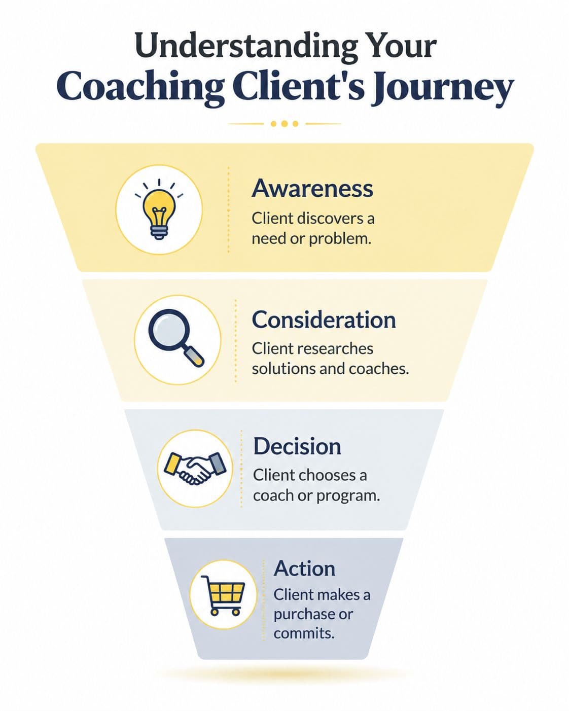
What they're thinking in the first few seconds
The first mental filter is simple.
- Is this for me: They're checking whether your language reflects their actual situation.
- Do you understand my problem: They want specificity, not broad “struggling to level up” phrasing.
- Do I want the outcome you're describing: They need to see themselves in the transformation.
A life coach might attract someone thinking, “I'm functioning, but I don't feel like myself anymore.”
A business coach might attract someone thinking, “I'm busy all the time, but my offer still feels messy.”
An executive coach might attract someone thinking, “I'm performing well, but I'm paying for it with constant tension.”
Those are different internal dialogues. A generic page flattens them. A strong page mirrors them.
Skepticism is part of the buying process
This matters even more now. In a post-2024 AI-saturated market, buyers are more skeptical of generic promises. Effective sales pages need to answer not just what's included, but why a skeptical buyer should believe this is right for them now, with credibility and specific proof taking priority over formulaic persuasion, as discussed in this sales page structure analysis.
That means each section of your page has a psychological job.
| Page section | What the client is silently asking |
|---|---|
| Headline | Is this relevant to me right now? |
| Problem framing | Do you get what this actually feels like? |
| Offer details | What exactly am I getting? |
| About section | Why should I trust you with this? |
| Testimonials | Has this worked for someone like me? |
| FAQ | What happens if I'm unsure, busy, or hesitant? |
| CTA | What's the next step, and does it feel safe? |
A skeptical buyer doesn't need more adjectives. They need fewer leaps of faith.
Why coaches often miss the mark
Coaches tend to underwrite the problem and overwrite the method.
They'll say too little about the cost of staying stuck because they're trying to be respectful. Then they'll say too much about modules, worksheets, frameworks, calls, and Slack support because that feels more tangible. But clients don't buy coaching because they love containers. They buy because they want change.
Your page should help them move through this sequence:
- Recognition: “That's exactly where I am.”
- Hope: “There may be a path out of this.”
- Trust: “This coach seems credible and grounded.”
- Safety: “I understand the offer and I know what happens next.”
If your copy skips recognition and jumps straight to pitch, the page feels cold. If it creates emotion but never lands in clarity, the page feels slippery.
The sweet spot is empathy with edges. Name the problem cleanly. Explain the solution plainly. Prove the offer credibly.
Anatomy of a High-Converting Sale Page Template
The strongest coaching pages follow a predictable sequence because readers need a predictable path. A high-performing sales page template is typically built in this order: headline, problem and solution framing, offer details, social proof, FAQs, pricing, and a clear CTA. That structure reduces cognitive load and makes the decision path explicit, as explained in Kit's guide to sales pages.
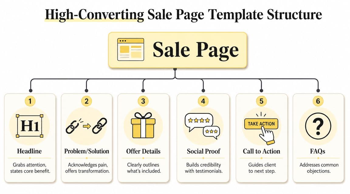
The headline that earns the scroll
Your headline has one job. It should make the right person think, “Yes, this is relevant.”
Good coaching headlines usually include one of three elements: a desired outcome, a clear audience, or a frustrating gap.
Try these formulas:
- For [audience] who want [outcome] without [pain point]
- Get [result] with a coaching process built for [type of person]
- From [current struggle] to [desired identity or result]
Examples:
- For burnout-prone founders who want a calmer, more focused way to lead
- Build a coaching business with clearer messaging and fewer custom offers
- From overthinking every decision to trusting yourself again
What doesn't work? Clever lines that hide the offer. If a stranger can't tell what you do in a few seconds, the headline is trying too hard.
The problem section that creates recognition
Many coaches often become timid. They don't want to “agitate pain,” so they stay abstract. But naming the specific experience is often the kindest part of the page.
Use a short pattern like this:
- What the client is dealing with now
- What it costs them emotionally or practically
- Why the usual fixes haven't worked
Examples:
- You know you're capable, but you're second-guessing every move and losing time to indecision.
- Your calendar is full, but your business still feels cobbled together behind the scenes.
- You've read the books, saved the posts, and tried to coach yourself through it, but the pattern keeps resurfacing.
A strong problem section says: “You're not broken. But your current way of solving this isn't getting you where you want to go.”
The solution and promise
After tension comes relief. This is the pivot where you explain your approach without dumping jargon on the page.
Use one of these structures:
- That's why I created [offer name], a [format] that helps [audience] do [result].
- Inside [offer name], we work on [core shift], so you can [practical outcome].
- This is for you if you want [result], but need [support, structure, or accountability] to get there.
Examples for coaches:
- That's why I created Reset, a 12-week coaching program for high-achieving women who want to stop performing calm and actually feel it.
- Inside Offer Clarity Lab, we refine your positioning, simplify your sales message, and help you present one offer people can understand quickly.
- This is for you if you're ready to lead with more confidence, but you don't want another motivational pep talk.
The offer details people can actually understand
You answer, “What do I get?” without writing like a checkout receipt.
Use a mix of short bullets and outcome framing:
- Private coaching sessions: Focused support to make decisions faster and with less mental spinning
- Voice or message support between sessions: So you don't lose momentum when real-life issues show up midweek
- Client resources and exercises: Tools that help you apply the work instead of just thinking about it
If you want to tighten layout and lead capture around the page, it helps to study how teams design high-converting modals so popups, exit prompts, and inquiry windows support the sale instead of interrupting it.
For inspiration on section flow and tone, it also helps to model these sales page samples before writing your own.
The about section that builds trust without hijacking the page
Your About section is not your life story. It's a trust bridge.
Use this simple sequence:
- What you understand about the problem
- Why you're equipped to guide this process
- How you approach the work
Examples:
- I work with founders who are tired of performing certainty while privately carrying decision fatigue.
- My coaching combines strategic thinking with honest reflection, so clients don't just get insight. They leave with action.
- I'm not here to hand you a personality-based script. I help you build a business that fits how you authentically lead.
What doesn't work is making this section entirely about your credentials if the reader still doesn't understand the offer. Relevance first, biography second.
Crafting Your Irresistible Offer and CTA
A weak page can sometimes survive decent traffic. A weak offer usually can't. If the packaging is muddy, the button copy won't save it.
That's why coaches need to spend less time hunting for clever phrases and more time shaping the actual decision. Your offer should feel easy to grasp, valuable to pursue, and safe to try.

Don't list components. Build a value stack
“Six calls, Voxer, workbook, portal access” is a contents list. It tells me what exists, not why I should care.
A stronger offer stack translates each part into an outcome.
For example, instead of this:
- 8 group calls
- private chat support
- worksheets
- bonus training
Try this:
- Weekly live coaching: Bring your actual issue, get direct support, leave with a plan
- Between-session access: Get unstuck while the decision still matters
- Reflection tools: Turn insight into action between calls
- Bonus training: Close common skill gaps without needing a separate course
The point isn't to inflate. It's to interpret. Your reader is always asking, “Why does this matter for me?”
Add risk reduction near the point of action
One of the most practical conversion tactics is placing social proof and risk-reduction close to the CTA. Guidance on sales pages recommends putting testimonials near the offer and using objection-handling elements like FAQs or a money-back guarantee because lowering perceived risk can increase sales, as shown in this OptimizePress walkthrough.
That matters for coaching because the biggest friction point is often not interest. It's uncertainty.
Use risk-reduction tools like:
- A clear guarantee: If it fits your offer model
- An honest FAQ: Answer timing, fit, expectations, and support
- Short testimonials near the button: Not buried far below
- Transparent next steps: Explain what happens after they click
If the CTA asks for commitment before the page creates safety, hesitation is the rational response.
CTA copy that invites action without sounding pushy
Most coaching pages use tired button text because it feels neutral. But “Submit” and “Buy Now” often create distance unless the audience is already very warm.
Use CTA copy that reflects the actual next step:
- Apply for coaching
- Save my spot
- Join the program
- Book my consultation
- Start my reset
- Get immediate access
If your offer starts with a conversation, say that. If it starts with checkout, say that. Ambiguity kills momentum.
A lot of coaches also need a cleaner way to share and track offer links across Instagram, podcast episodes, and guest features. A dedicated link in bio for coaches can help route people to the right sales page without sending them into a maze.
When you're refining CTA language, it also helps to review practical effective rhetoric strategies so your wording persuades through clarity and logic rather than pressure.
Here's a useful walkthrough if you want a visual explanation of offer framing and page flow:
A simple coaching offer example
Let's say you run a 10-week business coaching program for newer coaches.
A flat version sounds like this:
“10 weekly calls, messaging support, templates, and trainings.”
A stronger version sounds like this:
- Clarify your niche and offer so you stop rewriting your positioning every week
- Get coached live on sales conversations, content, and pricing decisions
- Use templates to speed up implementation without sounding generic
- Receive support between calls when client questions and doubts show up in real time
Same offer. Better translation.
That's what an irresistible offer usually is. Not more stuff. Better framing.
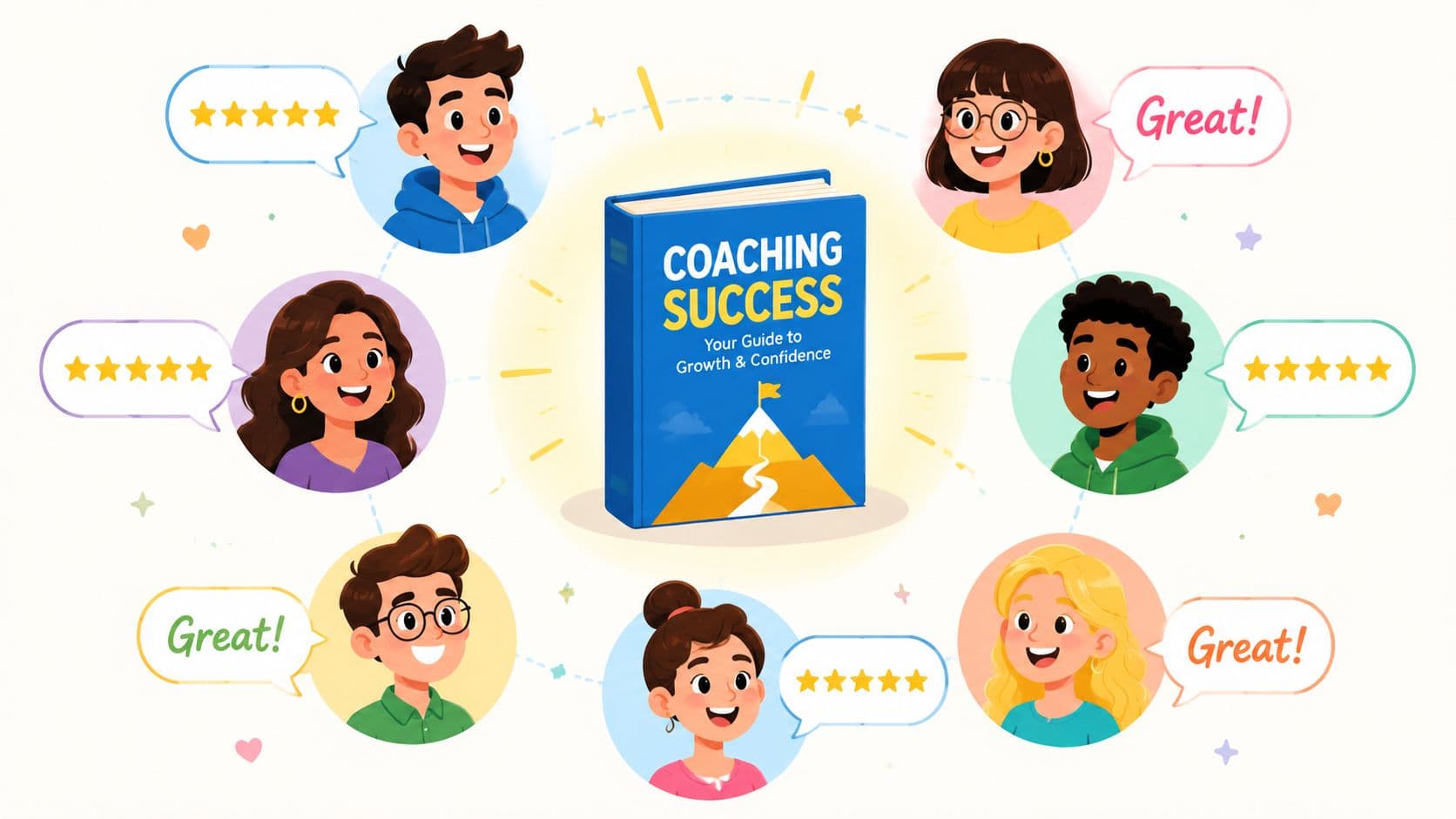
Building Unshakeable Trust with Social Proof
Most coaches know they need testimonials. Fewer know how to get ones that convert.
The common weak version sounds like this: “She was amazing to work with.” Nice sentiment. Useless proof.
The stronger version tells a small story. It shows where the client started, what shifted during the process, and what changed after. That kind of testimonial helps a buyer think, “That sounds like me.”
The difference between weak and useful
Weak testimonial:
“I loved this program and got so much out of it.”
Useful testimonial:
“Before this program, I kept changing my offer every month and felt embarrassed explaining what I did. During the coaching, I finally saw where I was overcomplicating everything. By the end, I had one clear offer, a simpler sales page, and much more confidence talking about my work.”
The second one gives context, movement, and specificity. It doesn't need inflated language because the story itself carries weight.
A simple testimonial prompt you can send
You don't need to hope clients magically write persuasive feedback. Prompt them properly.
Send something like this:
- Before we worked together: What were you struggling with or feeling stuck around?
- During the process: What did you notice about my coaching style, support, or approach?
- After or by the end: What changed in your thinking, actions, or results?
- For someone considering this: Who would you recommend this to?
That prompt helps clients produce usable language. It also keeps them from defaulting to polite praise.
Ways to display proof without making it feel staged
A good sale page template doesn't dump all trust into one testimonial block. It places proof where the reader needs reassurance.
Try a mix like this:
- Short quotes near claims: If you say the process builds confidence, place a testimonial that confirms that exact shift nearby.
- Screenshots with context: A message from a client can work if you explain what was happening at the time.
- Mini case stories: A short before-during-after paragraph often carries more weight than a polished quote card.
- Video clips: Useful when your audience wants to hear tone, sincerity, and nuance.
If you want more ideas for gathering and presenting proof, this guide to testimonials in marketing is a helpful companion resource.
Social proof works best when it answers a specific fear. “Will this work for someone like me?” is usually the real question.
Implementation Branding and A/B Testing
A strong page can still lose people if the design makes reading feel like work. Coaches often spend weeks polishing copy, then paste it into a page that looks dense, cluttered, or awkward on a phone.
That's expensive friction.
With mobile accounting for roughly 58% of worldwide web traffic, sales page templates need to support mobile-first behavior through clean hierarchy, minimal navigation, and thumb-friendly CTAs, according to Unbounce's sales page guidance. Long form isn't automatically wrong on mobile. But the page has to feel easy to move through.
Keep the page readable before you make it pretty
Use a few practical design rules:
- Choose one body font that's easy to scan: Fancy typography belongs in accents, not in paragraphs.
- Break up dense sections: Use subheadings, bullets, and short paragraphs so readers can find the point fast.
- Limit navigation choices: Too many menu links create exits when you want focus.
- Repeat key buttons: Let readers act when they're ready, not only at the bottom.
- Use visual contrast carefully: Buttons should stand out, but the page shouldn't scream.
If you want one tool option for building the broader client journey around your page, Coachful includes templates and workflows for coaching businesses, including client-facing structure around offers, onboarding, and follow-up.
Mobile checks every coach should do
Before you publish, open the page on your phone and test it like a prospect.
Look for these issues:
- Does the headline fit cleanly on screen
- Are buttons easy to tap with one thumb
- Do testimonials still feel readable
- Does any section become a giant wall of text
- Can someone understand the offer without pinching, zooming, or hunting
A sale page template should reduce effort, not require detective work.
Simple A/B Tests for Your Coaching Sales Page
You do not need a full optimization department to improve a page. Start with one variable at a time.
| Element to Test | Variation A (Control) | Variation B (Test) |
|---|---|---|
| Headline | Outcome-focused headline | Audience-plus-problem headline |
| Hero CTA | Apply now | Book a consultation |
| Button text | Join the program | Start my transformation |
| Offer section | Features-first bullets | Benefits-first bullets |
| Testimonial placement | One block lower on page | Short proof placed near CTA |
| About section | Credentials-first copy | Empathy-and-approach-first copy |
| FAQ length | Short answers | More detailed objection handling |
| Pricing presentation | Single payment shown first | Payment plan shown first |
Field note: Don't test five things at once. If the page improves, you won't know what caused it.
Branding matters here too. The page should sound like you and look like your business, but not at the expense of usability. If your brand voice is warm and direct, let the design support that. Clean spacing, clear buttons, and readable copy usually outperform visual drama that competes with the offer.
Your Sales Page Questions Answered
How long should my sales page be for a high-ticket coaching offer
Long enough to answer key questions. Short enough that nothing feels padded.
Higher-commitment coaching usually needs more explanation because the buyer has more to evaluate. But length itself doesn't persuade. If a paragraph doesn't clarify the problem, strengthen trust, explain the offer, or reduce risk, trim it.
Should I put a video on my sales page
Use video if it helps the buyer feel your presence and understand the offer faster. Don't use it as a substitute for clear copy.
A short welcome or offer-explainer video can work well near the top or around the offer section. Keep it focused. The page still needs to stand on its own for readers who won't press play.
Can I use the same sale page template for a webinar or low-cost workshop
You can use the same logic, but not the same depth. A lower-commitment offer usually needs a shorter page with less objection handling and less backstory.
The structure still holds: clear headline, problem, promise, offer details, proof, FAQ, CTA. You're just compressing the decision.
What's the best way to share the link to my sales page
Use the page where buying intent already exists. That usually means email campaigns, Instagram stories, podcast show notes, pinned content, guest features, and direct replies to people who ask about the offer.
The key is matching context to readiness. A cold audience may need content first. A warm audience often just needs a clean path to the page.
If you're ready to turn your offer into a clearer client journey, Coachful gives coaches one place to organize programs, manage client workflows, streamline onboarding, and support growth without stitching together multiple tools.