7 Sales Page Sample Breakdowns to Model in 2026

Coachful
Does your page feel polished, but still fail to turn readers into applications or bookings?
Coaches often assume the problem is personal. Maybe the offer is weak. Maybe the copy sounds awkward. Maybe selling just does not come naturally. In practice, the bigger issue is usually page friction. The reader lands on the page and has to work too hard to understand the promise, trust the method, or decide what to do next.
That is fixable.
A sales page works when it answers the quiet objections running in your buyer's head. Is this for me? Why this coach? Why now? Can I trust the result? If those answers are vague, even strong offers underperform. If those answers are clear, the page starts doing its real job, which is moving a skeptical reader toward a confident yes.
Analysts and conversion teams consistently report that landing pages can convert well when the message, proof, and call to action are aligned. You do not need to guess your way there. You need better models, better sequencing, and the discipline to test one meaningful change at a time. This guide on strategies for landing page experimentation is useful for that.
One more practical point. Many coaches send traffic to a homepage, an Instagram profile, or a cluttered link in bio page and hope the offer somehow sells itself. That setup usually scatters attention. A focused sales page gives the buyer one path, one promise, and enough proof to keep reading.
The examples below are not here to give you pretty design ideas. They show how strong pages handle buyer psychology on the page. You will see how effective sales pages build trust without sounding pushy, prove value without overexplaining, and ask for the sale without making you feel like you are performing confidence.
1. Lapa Ninja
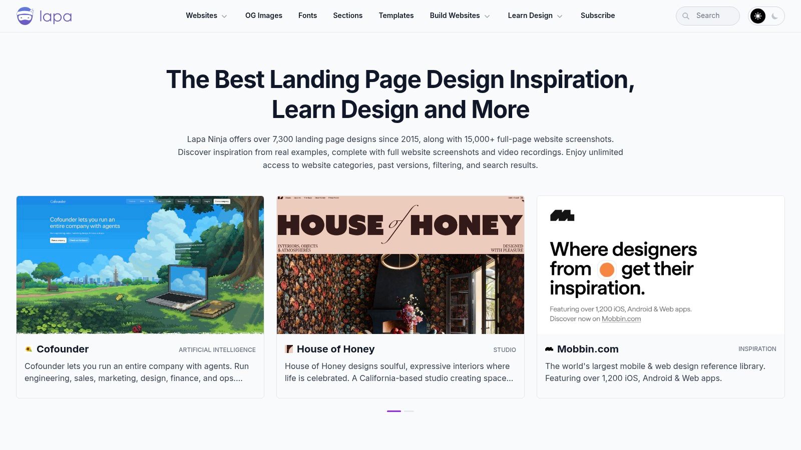
What do you study when you know your coaching offer works, but every sales page you draft still feels awkward, vague, or a little too pushy?
Start with Lapa Ninja. It gives you a fast way to study how strong pages are sequenced on the screen. For coaches, that matters more than design inspiration alone. Its primary benefit is seeing how pages earn trust in order, so you stop stuffing everything into the top half and hoping the reader figures it out.
That is the hidden reason many coach sales pages underperform. The problem usually is not bad intent or weak expertise. It is poor choreography. The promise shows up before the problem is clear. The CTA appears before the value feels concrete. Testimonials sit too late, or too early, to calm the buyer at the moment doubt kicks in.
What to look for inside Lapa Ninja
Use Lapa Ninja to compare pages across services, education, SaaS, and digital products, then study the decisions behind the layout.
Ask sharper questions than, “Do I like this page?”
- How does the hero frame the promise? A direct outcome often beats a clever introduction.
- When does proof appear? Strong pages place trust elements where skepticism rises, not wherever there was leftover space.
- How often does the CTA return? Repetition works when the ask stays consistent and appears after each major belief-building section.
- What gets explained before pricing or enrollment? Buyers need enough clarity to judge fit, not a full autobiography.
This is the part coaches often miss. A sales page is not a personal profile with a button at the bottom. It is a guided argument.
Practical rule: Borrow the sequence that reduces resistance. Do not copy the styling and assume the psychology comes with it.
Why coaches get value from it
Lapa Ninja helps when you are staring at a blank page and second-guessing every section. Should you lead with your story? Put testimonials first? Explain the method before naming the offer? The gallery gives you enough examples to spot patterns that repeat across categories.
That pattern recognition builds confidence. You start noticing that effective pages usually make one promise, support it with a few clear proof points, and keep the next step obvious. For a coach, that is reassuring because it answers the private fear behind the draft: “Do I need to sound louder to sell this?” Usually, no. You need a clearer order of ideas.
If you promote your offer from Instagram or other social channels, send people from a simple link in bio page to one focused sales page rather than scattering attention across five unrelated links.
Where Lapa Ninja falls short
Lapa Ninja shows what pages look like. It does not explain why a specific page converted, what traffic source hit it, or whether the copy matched a warm audience or a cold one.
So use it like a swipe file, not a verdict. Save pages that handle structure well. Then translate those patterns into your own coaching sale, your buyer's actual objections, and your level of trust with the audience. That is how you get a page that feels confident without sounding aggressive.
2. SaaS Landing Page Examples
A lot of coaches who serve companies make one expensive mistake. They write like a solo creator but sell to a team buyer.
That's where SaaS Landing Page Examples becomes useful. It isn't built for life-coach aesthetics or soft personal-brand pages. It leans into product clarity, operational trust, and business-ready layouts.
When this sales page sample style works
If you sell executive coaching, leadership development, manager training, or internal coaching programs, this gallery helps you study how B2B pages reduce risk. The annotated page elements are the primary advantage. You can scan for sticky CTAs, product shots, testimonials, comparison blocks, and demo-focused structures without digging through dozens of pages manually.
For coaches, that solves a specific fear: “Will this sound too salesy for corporate buyers?” Usually, the answer is no. Corporate buyers aren't allergic to selling. They're allergic to ambiguity.
Look for pages that do these things well:
- Show the workflow: Buyers want to know how delivery fits their existing process.
- Clarify the next step: “Book a demo” often works better than a hard enrollment ask in a higher-trust sale.
- Signal operational maturity: Security notes, integrations, and implementation details calm procurement-minded readers.
A coach selling to HR doesn't need louder persuasion. They need cleaner risk reduction.
Where you need to adapt it
This gallery can push you toward a colder, more software-like voice if you imitate too closely. That can hurt if your buyer still needs emotional trust. Coaching purchases often involve identity concerns, confidentiality, and perceived vulnerability. A page that feels too mechanical can flatten that.
So use the structure, not the temperature. Borrow the clean sections. Keep your humanity.
This is also the right place to study how different selling angles fit different segments. Guidance on selling angles and testing page versions makes the key point: choosing the angle is increasingly an A/B-test decision, not just a copywriting decision. For coaches, that's gold. A page for independent founders may need transformation and speed. A page for HR may need privacy, outcomes, and workflow fit.
3. SaaSpo
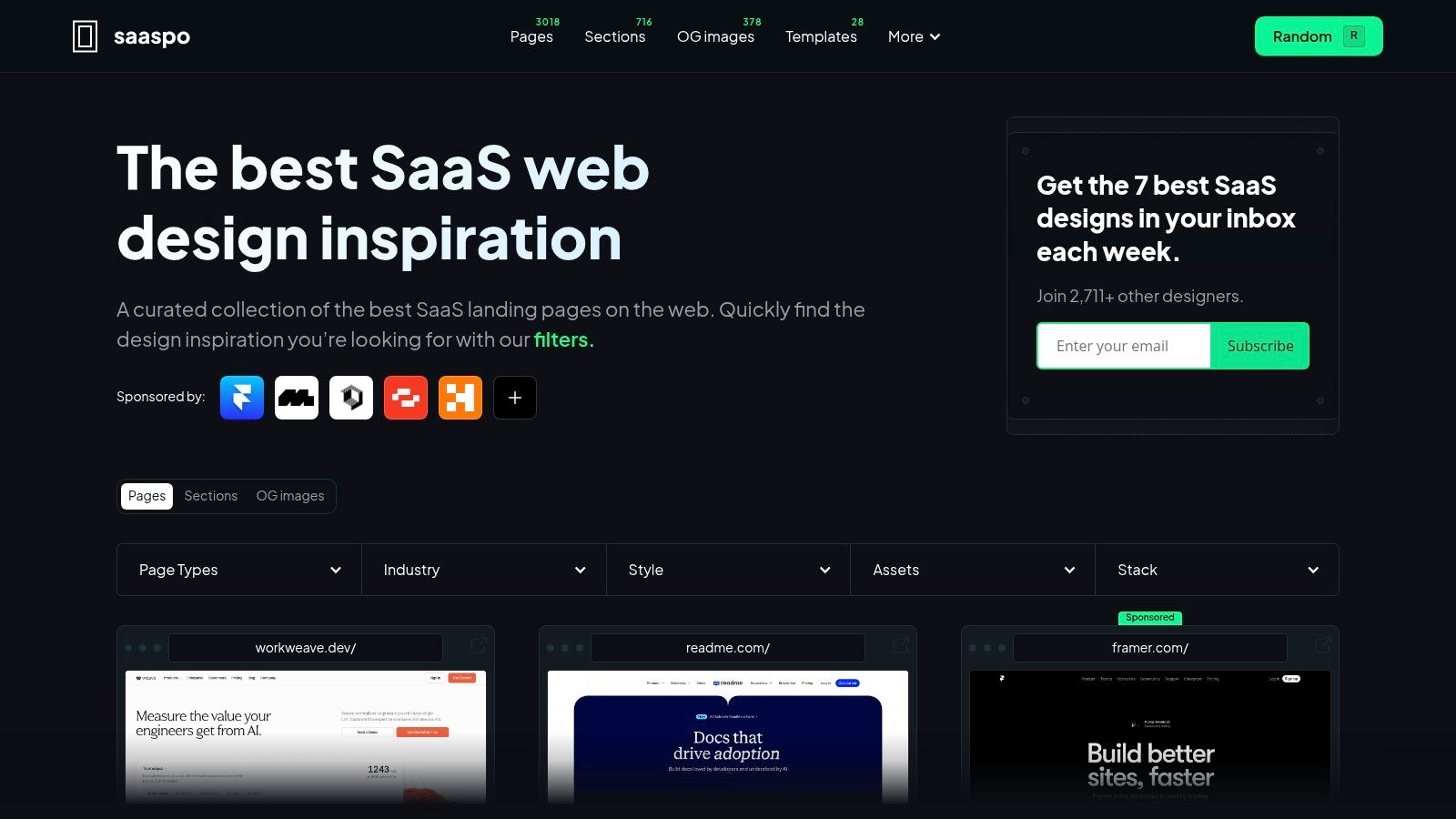
Some coaches don't need one page. They need a page system. Landing page, pricing page, demo page, maybe a product page if they bundle coaching with software, curriculum, or client portals.
That's where SaaSpo is stronger than a generic inspiration gallery. It lets you study different page types separately, which is useful when your funnel is more than a single enrollment page.
Why it helps with buyer psychology
A coach often tries to answer every objection on one page. Price. trust. process. outcomes. technology. onboarding. That's usually too much.
SaaSpo helps you see how strong brands distribute those objections across multiple pages. The landing page sells the next step. The pricing page frames choice. The product page explains functionality. The demo page lowers uncertainty. That separation is calming for the buyer because each page has one job.
For a coach running cohorts or enterprise programs on a coaching platform, this matters a lot. Buyers may need to understand both the human outcome and the operational setup. Putting everything on a single page often creates clutter instead of confidence.
What to borrow and what to ignore
Borrow the discipline around page roles. Ignore the temptation to sound like a startup pitch deck.
A few patterns worth stealing:
- Pricing-page restraint: Strong pricing pages don't drown the reader in explanation. They frame differences clearly.
- Demo-first logic: Higher-trust offers often convert better when the CTA matches commitment level.
- Proof near friction points: Put evidence where doubt naturally spikes, not where it merely decorates the page.
Another useful lesson comes from evidence standards. Advice on proof and objection handling on sales pages pushes a more credible approach: use precise proof, transparent objection handling, and behavior data to improve weak spots. That's especially relevant for coaching. A flashy promise gets attention. A believable promise gets booked.
The trade-off is that SaaSpo can feel too SaaS-heavy if your offer is intimate, personal, or transformation-led. If you're selling a one-on-one confidence program, don't turn your page into an app brochure.
4. PPC.io Landing Page Examples
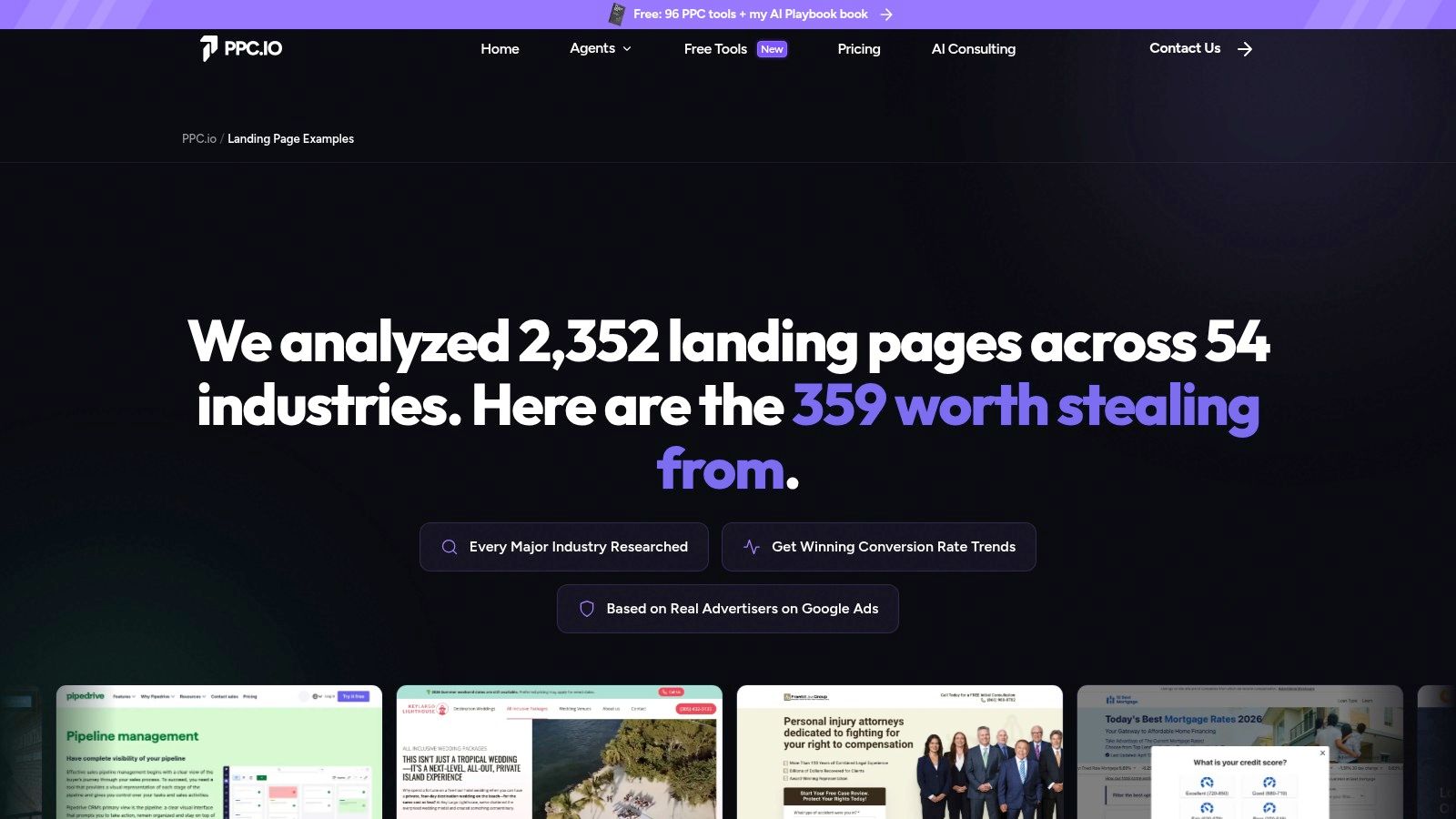
PPC.io Landing Page Examples is for the coach who thinks in campaigns, not just pages. That's an important difference. A beautiful page can still fail if it doesn't match the traffic source and the buyer's intent.
What I like here is the vertical grouping. You can study pages in categories like HR, payroll, CRM, ecommerce, and online education, then pull patterns from adjacent markets instead of only from “coaching” examples. That matters because coaching pages are often underdeveloped. Nearby categories frequently show stronger commercial discipline.
Best use for coaches running paid traffic
If someone clicks an ad about leadership coaching for managers, they should not land on a poetic manifesto about your mission. They should land on a page that immediately says what the program is, who it's for, what changes, and what to do next.
PPC.io helps you reverse-engineer that kind of message match. Its curated “worth stealing” angle is practical because it forces you to study why a section exists, not just whether it looks nice.
Your page doesn't need more personality if the visitor still can't answer “Is this for me?” in the first few seconds.
A strong pattern for proof
This tool is also useful when you're shaping case-study sections. Strong B2B case studies work best when they lead with a clear measurable result in the headline, show a snapshot box above the fold with basics like industry and KPIs, and include a before-and-after table plus proof elements such as a quote and simple diagram (B2B case study best-practice structure).
That structure translates beautifully for coaches. Instead of dumping three long testimonials in a slider, build one compact proof block. Example: team type, starting problem, intervention, visible result. Much easier to trust.
The limitation is that not every page in the library comes with deep commentary. Sometimes you'll need to infer what makes a section work. But if you already have decent marketing instincts, this saves time.
5. Webflow Made in Webflow Sales Cloneables
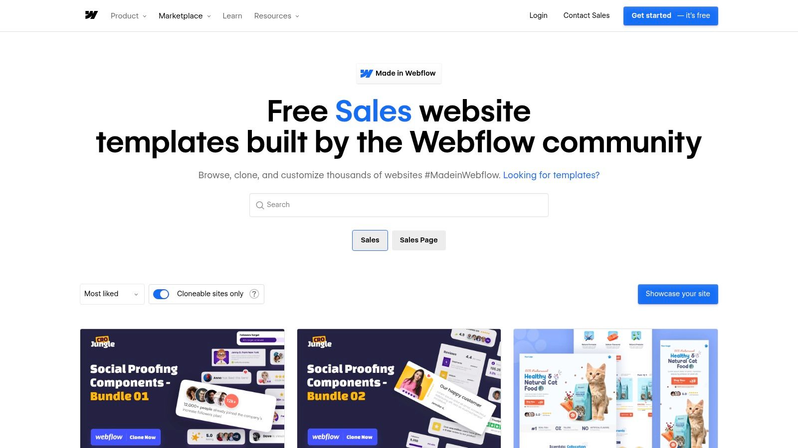
What if your real problem is not writing the sales page, but making it look credible enough to support a premium price?
That is where Webflow Sales cloneables earn their place. They are useful for coaches whose offer already has substance, but whose current page still signals DIY, underpriced, or unfinished. A strong sales page sample here is not just visual inspiration. It shows how layout, spacing, section order, and visual hierarchy subtly answer the buyer's private concerns: Is this coach established? Is this offer worth the fee? Will this experience feel high level?
Where Webflow earns the extra effort
Webflow works best when your sales process needs more than a simple opt-in page. Certification programs, high-ticket group coaching, executive coaching retainers, and multi-offer brands often need more room for nuance. You may need a long narrative, layered proof, FAQ sections that handle serious objections, and a page structure that keeps all of that readable.
That matters because coaches often fear that more copy will feel pushy. Usually the opposite is true. Thin copy creates pressure because it asks for trust before the reader has enough context. A well-built long page lowers resistance when each section does a specific job.
Webflow gives you control over that job. You can shape a cleaner reading experience, build reusable proof blocks, and keep the page feeling premium instead of heavy.
The real trade-off
Webflow can sharpen a strong message. It can also distract you from fixing a weak one.
I see this often with coaches who are uncomfortable selling. They spend hours adjusting margins, animations, and typography because design work feels safer than making a direct promise. The page gets prettier while the core questions stay unresolved: who this is for, what changes, why this method, why now.
So use cloneables after your message is reasonably clear. If you are still testing the offer itself, a simpler coaching website builder is usually the better call. Speed beats polish at that stage.
How to study these sales page samples like a copy strategist
Do not just browse for style. Examine what each section is doing psychologically.
Look for pages that handle premium pricing without sounding defensive. Notice where they introduce authority, where they shift into proof, and how they ask for the sale without sounding needy. Pay attention to the sequence. Strong pages often delay detail until the reader has a reason to care, then answer objections right before the call to action.
That is the behind-the-curtain lesson here. A high-converting page rarely wins because it is beautiful alone. It wins because the design makes the copy easier to believe.
One practical caution. Cloneable does not mean beginner-friendly. If you are not technical, expect a learning curve before the page feels stable, consistent, and ready to publish.
6. Unbounce
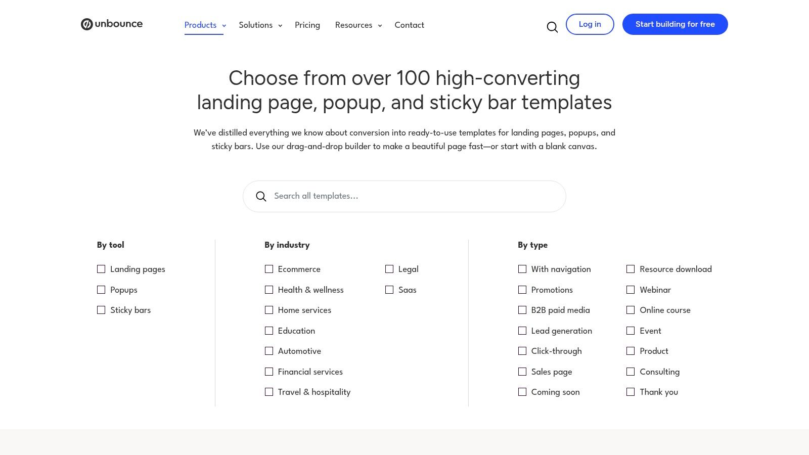
What if the actual problem is not your writing, but the fact that you never test the part of the page that makes a buyer hesitate?
Unbounce suits coaches who want more than inspiration. They want a place to publish a page, test a sharper version, and see which message gets replies, bookings, or applications. You can explore that setup through Unbounce landing page templates.
That matters because coaching offers often fail in a very specific way. The coach has real expertise, but the page softens every claim to avoid sounding pushy. The promise gets blurred. The call to action turns vague. The proof section rambles instead of reducing risk. Then the coach assumes the offer is weak, when the actual issue is that the page never gave the buyer enough confidence to act.
Unbounce is useful here because it supports testing at the message level. That is the behind-the-curtain advantage. You can stop arguing with yourself about whether a line feels too bold and start checking whether buyers respond better to one promise, one CTA, or one proof format over another.
What to test first
Start with the parts that change perceived value fastest.
- Headline angle: Lead with the result or lead with the method.
- CTA wording: Ask for a consult, an application, or a fit call.
- Proof format: Use a testimonial, a short case summary, or a specific before-and-after outcome.
I usually tell coaches to test the claim before they test the layout. A prettier page rarely fixes weak positioning. A clearer promise often does.
The proof section deserves extra discipline. Crazy Egg's guidance on case study examples points to a simple rule that also applies here. The strongest stories stay focused on a small set of metrics tied directly to the original problem. That is a useful filter for coaches who keep piling on screenshots, praise, and life story details. If every result goes on the page, none of them carries enough weight.
There is a trade-off. Unbounce makes more sense when you have enough traffic to learn from your tests. If your offer is brand new and only a handful of people see the page each week, heavy experimentation can become an elaborate means to avoid making a firm sales argument. But if you are running webinars, paid campaigns, cohort launches, or segmented offers, Unbounce gives you a practical way to answer the questions coaches internally ask themselves all the time. Will this sound too aggressive? Does this proof build trust? Is my CTA creating pressure or clarity?
7. Instapage
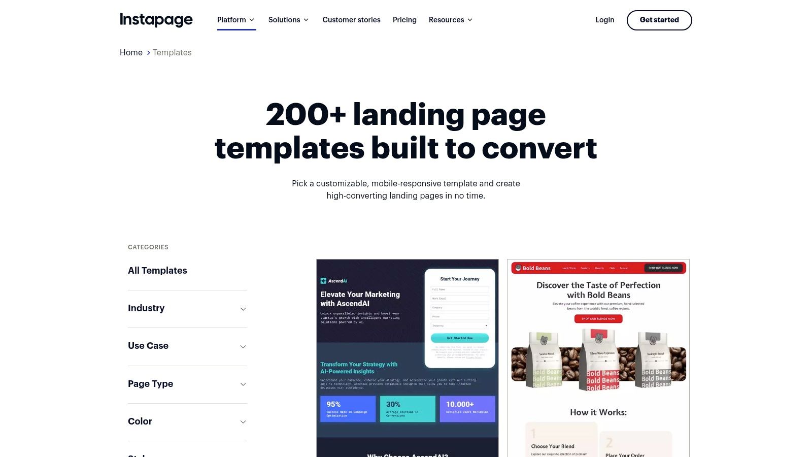
Need a sales page process that still works once other people start touching your offer? Visit Instapage templates.
Instapage fits the stage where selling stops being a private writing session and becomes a coordinated build. A coach may write the promise, a designer adjusts layout, a media buyer wants message match with the ad, and someone else asks for legal or brand changes. In that situation, reusable blocks and built-in collaboration are not nice extras. They are what keep the page from turning into a slow, opinion-heavy mess.
Best fit for teams and repeatable offers
This option works well for coaching schools, L&D teams, and businesses running several campaign variations at once. If you already know which testimonial format, proof strip, FAQ block, or CTA section keeps earning attention, Instapage helps you reuse those assets without rebuilding them from scratch every time.
That matters for a simple reason. Coaches often worry that stronger selling will make the page feel pushy, so they keep adding explanation, extra sections, and longer forms. Friction usually rises fast when that happens. Instapage is useful because it makes it easier to standardize the parts that protect conversion. Fewer unnecessary fields. Cleaner section order. Faster approval cycles. More consistency between what the ad promised and what the page delivers.
The best builder for your sales page sample is the one that helps you publish the clearest believable version of your offer, not the one with the longest feature list.
The trade-off is that Instapage can be too much for a solo coach with one signature offer and low traffic. If you are still testing your niche, your mechanism, or your core promise, extra workflow features will not fix weak positioning. They may just make the build feel heavier and more expensive.
Where Instapage earns its place is operational control. If several people are involved, it helps you protect the psychology that makes a sales page work. Clear promise. Repeated proof patterns. Low friction. A direct CTA that does not get diluted by committee.
Top 7 Sales Page Samples Comparison
| Tool | 🔄 Implementation complexity | ⚡ Resource requirements | 📊 Expected outcomes | 💡 Ideal use cases | ⭐ Key advantages |
|---|---|---|---|---|---|
| Lapa Ninja | Low, browse and manually curate examples | Minimal, time to review; no dev required | Design/layout inspiration; no conversion metrics | Modeling coaching/program page flows and layouts | Extensive, up‑to‑date gallery with full‑page screenshots |
| SaaS Landing Page Examples | Low, browse and translate patterns into your builder | Minimal–Moderate, adaptation effort to implement patterns | SaaS‑specific page patterns for demos, pricing, CTAs | B2B/SaaS positioning, enterprise‑oriented coaching offers | Annotated elements and daily updates for current patterns |
| SaaSpo | Low–Moderate, filtering helps narrow choices | Minimal–Moderate, curation + implementation work | Assemble multi‑page funnels (landing → pricing → demo) | Companies/coaches targeting HR, L&D, enterprise audiences | Granular filters and separate collections by page type |
| PPC.io Landing Page Examples | Low–Moderate, practitioner analysis reduces guesswork | Moderate, requires copy adaptation and testing | Actionable copy, CTA and proof patterns by vertical | Niche verticals (HR, courses, CRM) and conversion copy modeling | Curated "worth stealing" picks with practitioner notes |
| Webflow (Made in Webflow) | Moderate–High, cloneable but requires Webflow skills | Moderate, design skill + Webflow site plan for hosting | Brand‑polished, fully editable sales pages with CMS | Content‑rich coaching/SaaS sites needing custom design | Cloneable templates with full design control and CMS |
| Unbounce | Low–Moderate, drag‑and‑drop + built‑in testing | Moderate, subscription + marketer time for campaigns | Fast publish + A/B testing for conversion optimization | PPC campaigns and marketers launching targeted coaching offers | Conversion‑focused templates, DTR features like dynamic text |
| Instapage | Low–Moderate, templates + reusable blocks; team workflows | High, premium pricing and team collaboration needs | Standardized, reusable page builds at enterprise scale | Enterprise paid acquisition, teams needing governance | Instablocks for reuse and strong collaboration/approval tools |
Turn These Samples into Your Own Client Magnet
Inspiration without implementation is procrastination wearing a clever outfit. You've now seen seven different ways to study or build a sales page sample, and the key lesson isn't that one tool is perfect. It's that each tool solves a different blockage in the coach's mind.
If you're stuck on structure, study galleries like Lapa Ninja. If you sell into companies, use SaaS-oriented libraries to learn how business buyers think. If you need a polished branded page, cloneables can speed you up. If your real problem is uncertainty, not design, use a builder that supports testing so you stop editing by emotion.
The bigger shift is psychological. A weak sales page makes you feel as if your offer is being rejected. A strong page separates those two things. It lets your market respond to a clear promise, a visible process, and proof that feels believable. That clarity protects your confidence because you can finally diagnose what's wrong. Is it the angle? The proof? The CTA? The audience fit? Now you can answer that.
Keep your page simpler than your anxiety wants it to be. Most coaches over-explain because they're afraid of being misunderstood. They add more modules, more philosophy, more story, more background. Buyers usually don't need more content. They need a cleaner decision path.
That means one promise near the top. One primary action. Proof placed where skepticism rises. Objections handled without defensiveness. Real visuals. Clear outcomes. Fewer distractions.
And most important, stop copying surface tactics. Don't borrow urgency from a page selling a low-trust impulse product if your buyer is making a careful professional decision. Don't imitate someone else's tone if it conflicts with your actual relationship style. The strongest sales page sample is the one that matches your audience's level of awareness, risk, and desired outcome.
If you build inside Coachful, you can keep that page connected to the rest of your client journey instead of duct-taping forms, scheduling links, payments, and program delivery across separate tools. That matters because confidence doesn't come only from better copy. It comes from knowing the whole experience, from first click to first session, feels coherent and professional.
Start with one page. Pick one structure from this list. Make it clearer than your current version. Then publish and learn.
Coachful helps you turn a strong sales page into a complete coaching business system. You can build a professional client-facing experience, manage onboarding, scheduling, payments, programs, and follow-through in one place at Coachful.