Instagram Carousel Ideas for Coaches: 5 Slide-by-Slide Briefs

Coachful
Editorial Team
“What can I put in an Instagram carousel that shows my coaching is useful without giving a sales pitch on every slide?” Teach one small decision, show the reasoning with a concrete example, then offer one relevant next step. A carousel should be useful even to someone who never becomes your client.
The five Instagram carousel ideas below are complete, slide-by-slide briefs for coaches. Choose between a decision comparison, an annotated rewrite, a private reflection exercise, a process preview and a buying-information deck. Each format has a different job, not just a different headline.
All copy and situations are original hypothetical examples, not client stories, testimonials or claims of results. Replace the details with work you are competent to discuss. These are editorial templates you can build in your preferred design tool, not evidence that any particular post will generate enquiries.
Choose a carousel by the question it answers
- “Which approach suits my situation?” Use the decision comparison.
- “What would better look like?” Use the annotated rewrite.
- “What should I notice first?” Use the private reflection exercise.
- “What actually happens in coaching?” Use the process preview.
- “What am I buying?” Use the buying-information deck.
This is a practical selection rule, not an algorithm strategy. A coach with repeated questions about their package needs a different post from a coach whose audience does not yet understand the problem. Start with the question people actually ask you, using non-identifying notes rather than copying a client's words.
Instagram's official carousel instructions describe a feed post containing multiple photos or videos. This article focuses on static teaching panels, not Stories, Reels or a full social-media strategy. You do not need to use the platform's maximum number of slides; stop when the answer is complete.
1. The decision comparison: help someone choose between two reasonable options
Best for: showing judgement rather than presenting your favourite method as the answer to everything. A career coach could compare asking for a change in an existing role with exploring a different role. The post should clarify a next step, not tell a stranger whether to resign.
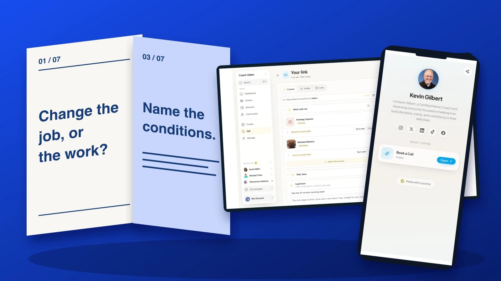
- Opening: “Change your job, or change the job you have?”
- Define the decision: “First separate the work itself from the conditions around it. Which part do you want to change?”
- Option A: “If you like the work but the scope is unclear, start by exploring a role-clarity conversation.”
- Option B: “If the work itself no longer fits, investigate alternative roles before treating a new employer as the whole answer.”
- Important exception: “Safety, discrimination and contractual concerns may need qualified support, not a simple career exercise.”
- Small action: “Write two lists: what I want to keep, and what I want to change.”
- Invitation: “Save this for your next career-planning conversation.”

Design direction: keep the two options visually equal. Use the same heading size and comparable space, then give the exception its own panel. Do not make one route green and the other red unless one really is unsuitable under the conditions you explain.
Caption starter: “A different employer may change the conditions without changing the work. Before choosing a route, name which part needs to be different.” Add the important limits in the caption as well as on the slides. If the comparison needs ten exceptions, narrow the question.
Trade-off: a nuanced comparison will not deliver a dramatic verdict. That is the point. You are demonstrating how you help a person think, not pretending to know their situation from a swipe.
2. The annotated rewrite: make an improvement visible
Best for: coaches whose work includes communication practice. Instead of posting “be more assertive,” show how a vague sentence changes when the speaker names the task, constraint and request. Use a fictional example, not a recognisable workplace exchange.
- Opening: “A clearer way to say: ‘I am too busy.’”
- Original: “I cannot do this. I have too much on.”
- Name the work: “I am completing the client report and preparing tomorrow's review.”
- Name the constraint: “I cannot finish those and the new analysis by Friday.”
- Make a request: “Which item should move, or who could take the analysis?”
- Explain the change: “The rewrite makes the trade-off discussable. It does not guarantee agreement.”
- Invitation: “Try writing your own version privately before the conversation.”

Design direction: show the original sentence once, then build the replacement line by line. Underline the new information, rather than covering the slide in arrows. The reader should see what changed without needing a paragraph of commentary.
Caption starter: “Clearer wording cannot remove a genuine workload problem. It can help you make the competing demands explicit.” That distinction protects the post from implying that employees can solve every organisational issue with a better script.
Trade-off: a sample sentence can sound unnatural in someone else's voice. Invite adaptation. If your audience faces a power imbalance, retaliation risk or an employment dispute, acknowledge that wording practice is not a substitute for appropriate professional support.
3. The private reflection exercise: offer a useful observation, not a public diagnosis
Best for: introducing the kind of noticing a coach helps with. The exercise should produce a modest input to a later conversation. Avoid “find your trauma response” quizzes or a score that pretends to identify a condition.
- Opening: “Before you redesign your week, find one friction point.”
- Choose a moment: “Pick one task you delayed this week. Use an ordinary example you are comfortable reflecting on.”
- Describe it: “What was the first visible action? ‘Sort my career out’ is not an action; ‘list three roles to investigate’ is.”
- Look at conditions: “What was missing: information, time, a decision, permission or a practical resource?”
- Choose one adjustment: “Make the first action smaller, or obtain one missing input.”
- Keep the limit: “This is a reflection prompt, not a test or an explanation for every difficulty.”
- Invitation: “Keep your notes private. Save the prompts if you want to revisit them.”

Design direction: show an unfinished observation becoming one concrete action. A blank writing line can communicate the invitation better than a fake dashboard or an invented assessment score. Give readers enough time and space to think without making disclosure part of participation.
Caption starter: “You do not need to describe your situation in the comments. The useful output is one observation you can work with.” If you later offer a worksheet, provide the actual resource and explain any information requested to access it.
Trade-off: keeping the exercise private may generate fewer comments. That is not a defect. A coaching business should not treat personal disclosure as an engagement tactic.
4. The process preview: show how the work moves, not just what you promise
Best for: prospects who cannot picture the service. Show one plausible sequence within your real delivery approach. Do not turn the sequence into a rigid promise that every client reaches the same milestone by the same week.
- Opening: “What would we do in coaching about delegation?”
- Choose a situation: “We would start with one responsibility you are considering handing over.”
- Explore the decision: “We might examine the required outcome, decision authority and constraints.”
- Prepare an experiment: “You could plan a conversation that makes the responsibility and review point explicit.”
- Review what happened: “At a later session, we would explore what you noticed and what needs adjusting.”
- Explain the boundary: “Coaching supports your thinking and practice. I do not manage your team for you.”
- Invitation: “Read the coaching overview if you want to see the format, scope and enquiry process.”

Design direction: use a continuous path across the middle panels, with one visible decision at each point. Keep it clearly illustrative. Do not insert a chart of imaginary confidence gains or a screenshot containing real client notes to make it look more credible.
Caption starter: “This is one example of how we might work, not a standard route every client must follow.” Then state what your actual service includes. A hypothetical illustration should help someone understand the offer, not quietly expand its contractual scope.
Trade-off: a process preview can become an inward-looking tour of your method. Keep asking what the potential client needs to understand: what they bring, what happens together, what they try afterwards and where your responsibility stops.
5. The buying-information deck: answer the practical questions before asking for a call
Best for: a real offer that people are already considering. This deck is not a countdown or a disguised motivational lesson. It is a concise decision aid. Include only current terms and a truthful next step.
- Opening: “Considering my interview-preparation coaching? Start here.”
- Who it is for: “For professionals who want structured practice explaining their own experience in interviews.”
- What we do: “We identify relevant examples, practise responses and review how clearly you communicate your contribution.”
- Practical terms: “Add your actual session format, package length, price and payment information here.”
- What it does not promise: “No coach can guarantee a job offer or an employer's decision.”
- Before buying: “Read the scheduling, cancellation and suitability information on the package page.”
- Invitation: “Use the package link in my profile to read the details and follow the stated enquiry process.”

Design direction: treat this like a compact service prospectus. Make practical information readable, not small-print decoration. The terms placeholder above is deliberately not publish-ready: replace it with your own checked information before using the deck.
Caption starter: “Here is the practical information for deciding whether this support fits. The linked page contains the current terms.” If details change, review the old post as well as the destination. A stale feed post can contradict a freshly updated sales page.
Trade-off: publishing clear terms may reduce casual enquiries. The useful question is whether suitable people can make a better decision, not whether the post produces the largest inbox.
Build the destination before the final slide
A static carousel and its caption should not depend on a clickable slide image. If your invitation points people to a profile link, check the real route from a logged-out phone. Name the destination: “Read the interview coaching package” is more useful than “Learn more.”

The Coachful demo link workspace shows editable destinations and a mobile preview. It illustrates the business-side handoff after an Instagram post; it does not demonstrate carousel creation, social publishing or automatic Instagram messaging. Put the relevant destination where someone can find it, and remove expired links.

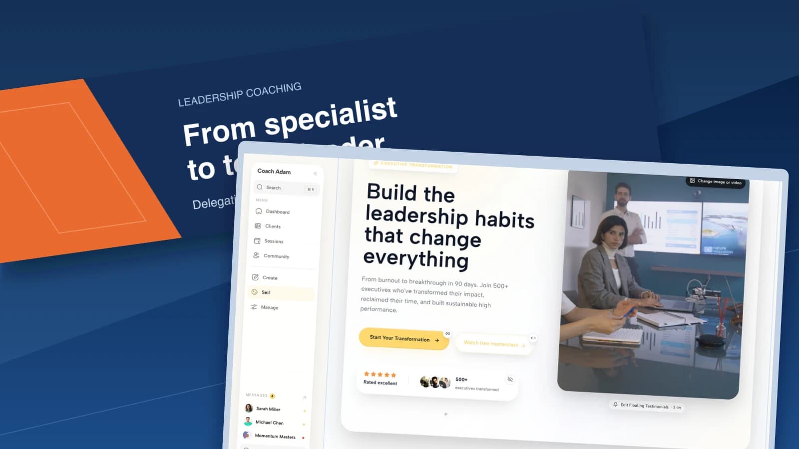
If the carousel explains a service, the destination needs to confirm its audience, format, limits and next step. The real Coachful website-editor screenshot illustrates reviewing that destination. Its demo wording is not a substantiated outcome claim for your practice, and it is not a template to copy uncritically.
If you offer a resource, test delivery before mentioning it. If access requires an email address, explain what the person receives and keep newsletter permission separate. A request for a worksheet is not permission to subscribe someone to unrelated messages.

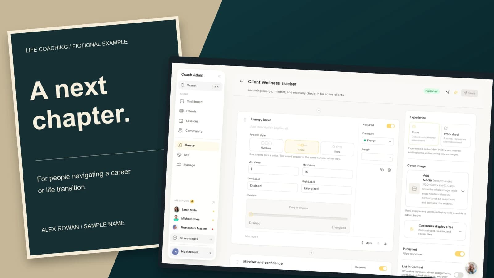
The form-builder example shows a client wellness tracker, not a ready-made marketing quiz. That distinction matters: do not reuse a detailed client form as the price of a simple download. Review fields, necessity, consent wording and access before choosing any form for a public campaign.
Make the deck readable before making it elaborate
Choose a consistent canvas and check the complete deck in your actual posting flow. Instagram's official instructions note that the selected orientation affects the whole carousel. Do not assume each panel can use a different crop without consequences. Keep important words comfortably away from edges and inspect the profile preview too.
Use one main idea per slide, clear contrast and type you can read on a phone without zooming. If you need tiny text, edit the argument. A design that looks impressive on a large monitor may be useless at feed size.
Write meaningful alternative text using the options available in your posting interface, and include the core lesson in the caption or a linked accessible text version. Do not make colour alone carry the distinction between an original and a rewrite. Check that numbering and labels still explain the sequence without the styling.
Read slides in order without the artwork. Each should advance the argument or give the promised payoff. Delete the panel that only says “keep swiping” if it contributes nothing else. Then inspect each panel on its own: a shared slide should not become misleading when separated from the deck.
Review evidence without inventing an algorithm rule
For your first test, record the question answered, format used, next step and production effort. Where your account provides them, review reach, saves, shares and profile activity alongside voluntary enquiries. These signals are not interchangeable: a save does not prove someone intends to buy coaching.
Use repeated questions to improve the next version. If people misunderstand the comparison, clarify the conditions. If they ask where the resource is, fix the destination. If relevant people read but do not enquire, investigate the offer and audience before deciding the artwork needs more effects.
Do not claim a particular slide count, posting time or format guarantees leads. Small samples and overlapping exposure make attribution uncertain. Ask new enquirers how they found you without forcing them to name one post as the cause.
Frequently asked questions
How many slides should a coach use in an Instagram carousel?
Use enough to answer one question completely. The seven-panel examples here are a manageable editorial starting point, not a platform requirement or performance benchmark. Combine or remove panels when the explanation remains clear.
Can I turn an old article into a carousel?
Yes, but extract one decision or worked example rather than shrinking every paragraph. Rewrite for the sequence, preserve important qualifications and offer the full article only when it genuinely adds useful depth.
Should every carousel end with a discovery call?
No. A comparison may invite saving; an exercise may invite private reflection; a service explanation may point to a package. Choose the action that follows from the actual lesson and the reader's likely readiness.
Can I use a client's story as an example?
Only with appropriate permission and careful attention to identifiability, accuracy and professional obligations. Removing a name is not always enough. A clearly labelled fictional example is often the simpler way to demonstrate your thinking.
Make one useful deck, then check the handoff
Pick the unanswered question that is costing your audience the most uncertainty. Choose the matching format, write the useful answer in plain text and build only the slides it needs. Test the final invitation before exporting the artwork.
If the missing piece is the page or form behind that invitation, try the interactive Coachful demo. Inspect the link, website and form surfaces shown above, then decide what your own reader needs after the swipe. The software supports the destination; your judgement makes the post worth reading.