LinkedIn Banner for Coaches: 5 Examples and a Design Brief

Nour
Founder, Coachful
“My LinkedIn profile says I am a coach. What should the banner add without turning it into a tiny billboard?”
A useful LinkedIn banner for coaches makes one thing easier to recognize: who your coaching is for, the decision you help people work through, or a relevant next step. Choose one of those jobs, use a short truthful line, and check the uploaded image on both desktop and mobile. Your banner should support your profile, not try to replace your services page.
Start with an evergreen audience banner unless you have a good reason to promote a resource or program. You do not need a quotation about limitless potential, a wall of client logos or five different invitations. You need a visitor to recognize the same coaching practice in your banner, profile text and destination page.
Below are five original design examples, their trade-offs and a copyable design brief. They are fictional specimens, not real LinkedIn profiles or evidence of bookings.
Choose the banner's job before choosing a template
Ask what a suitable visitor still needs to understand after reading your name and headline. The banner is a visual supporting surface. It is not the place to fit every credential, specialty and service you have ever offered.
- Audience-led: help someone recognize that the coaching is for them. Best default for a stable private practice.
- Decision-led: name the situation bringing someone to coaching. Useful when your audience recognizes the problem more readily than the specialty.
- Resource-led: point toward one genuinely useful starting resource. Appropriate when the download exists and has a clear destination.
- Program-led: explain a specific group or offer. Useful during an actual promotion window, with maintenance afterward.
- Employer-facing: signal the organizational buyer. Relevant when HR or a people-development team commissions the work.
These are five different communication jobs, not a ranking of coaching niches. A career coach might use the first three at different stages of their practice. An executive coach might choose an employer-facing version even when the coaching itself is one-to-one.
If the underlying sentence is still unclear, work on your LinkedIn headline first. That guide covers role, audience and scope wording. This one covers the visual banner: what belongs in the image, how to compose it and how to test its presentation.
1. An audience-led banner for an evergreen practice
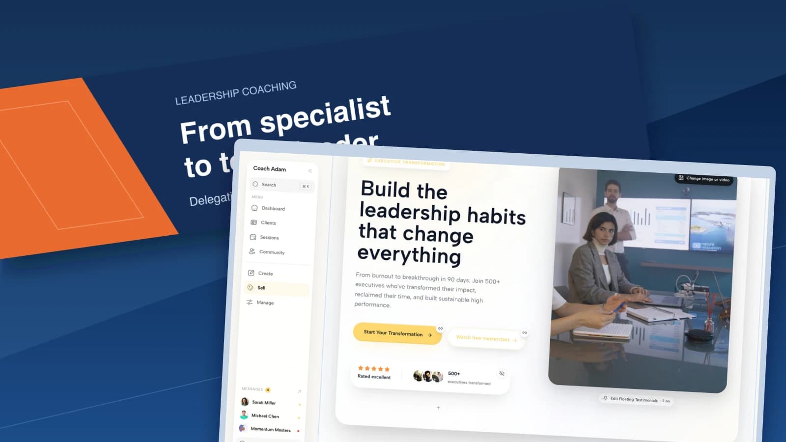
Example copy: “From specialist to team leader.” Supporting line: “Leadership coaching. Delegation. Feedback. Difficult conversations.”

This version works because it names a recognizable transition. A new manager can understand the relevance without decoding a proprietary method. The supporting topics make the work more tangible without guaranteeing that a team will become more productive.
Use one main phrase at a noticeably larger size than the supporting words. In the example, the contrasting left field adds structure while the main message sits away from the lower-left area. This is a design starting point, not a universal LinkedIn safe-zone specification.
Choose it when: your audience and service are stable, and most visitors need basic recognition rather than a launch announcement. Trade-off: a broad transition can still sound like generic consulting unless the profile explains your actual coaching approach.
Do not fill the spare space because it looks available. Space helps the main phrase remain legible. Your portrait, headline and introduction already carry other information around the image.
2. A decision-led banner for a recognizable client situation
Example copy: “A move worth making.” Supporting line: “Career coaching. Explore your next role before you leap.”

Here the banner starts with the decision rather than the coach's title. That can suit someone comparing a promotion, a new employer or a different professional direction. The supporting line still names career coaching so the invitation is not mistaken for recruitment.
Keep the wording within your actual competence. “Explore your next role” describes work you can support. “Your dream job in six weeks” promises an employment outcome controlled by other people. A claim does not become safer because it appears in an image rather than body copy.
Choose it when: inquiries consistently begin with a particular decision, and your offer genuinely serves that decision. Trade-off: a poetic headline alone can be too vague. Include an ordinary service label and avoid making visitors guess what you sell.
Ask an appropriate reader what they think the service involves. If they say recruitment, therapy or financial planning and you provide none of those, revise the banner. The test is understanding, not whether another coach compliments the design.
3. A resource-led banner with an honest route to the resource
Example copy: “Before your next career move.” Supporting line: “A reflection worksheet for your options. Find the resource in Featured.”

This approach gives a visitor something specific to explore before considering coaching. It works only if the resource exists, is relevant and is easy to find. Do not publish a banner invitation while the worksheet is still an idea in your notes.
The banner image is not a clickable website button. A painted rectangle reading “Download now” does not create a link. Point to a destination that your current LinkedIn account actually presents, such as an appropriate Featured item, and verify the route manually.

Keep the handoff proportionate. If the invitation promises a worksheet, the next page should explain and deliver that worksheet. Do not silently substitute a sales-call application or add people to unrelated marketing because they wanted the resource.
Choose it when: the resource helps the same audience as your paid service and you can maintain its destination. Trade-off: it asks you to manage a second message and a live asset. A broken or irrelevant resource can undermine an otherwise sensible profile.
If you collect an email address, explain what the person receives and any subscription separately. A banner is too small to carry the necessary detail, but the destination is not. Avoid asking for sensitive coaching information merely to deliver a general reflection sheet.
4. A program-led banner for a real group offer
Example copy: “Practice leading.” Supporting line: “Small-group leadership coaching. With other first-time managers. Read the group outline in Featured.”

This version introduces a format as well as an audience. It is useful when you want profile visitors to explore a defined group rather than assume every service is private coaching. The destination can explain participation, session structure, dates, price and suitability.
Only include enrollment dates, remaining places or an early rate when they are real and current. If you cannot maintain the banner, use an undated invitation to read the program outline instead. A countdown baked into an image is especially poor maintenance: it becomes wrong without changing itself.
Choose it when: this is the offer you genuinely want appropriate visitors to consider now. Trade-off: it can make your entire practice look like one program. If corporate or private clients remain central, decide whether the promotion deserves that prominence.
Set a review reminder when you upload a time-bound version. After enrollment closes, replace it with an evergreen banner or an accurate next-cohort invitation. Do not leave “Now enrolling” visible simply because redesigning it feels like a chore.
5. An employer-facing banner for commissioned coaching
Example copy: “Support the move into management.” Supporting line: “For HR and people-development teams. Coaching engagements for newly promoted managers.”

The reader here is the buyer, not necessarily the participant. The banner signals that you understand the commissioning context. Your profile and website should then explain scope, suitable participants and how an organization can discuss an engagement.
Do not try to establish credibility by dropping in logos you have no permission to use. Coaching one employee privately does not automatically mean a company bought or endorsed your services. Client confidentiality and accurate representation still apply to a very small image.
Choose it when: organizations regularly commission your work or you have deliberately built an appropriate B2B offer. Trade-off: individual buyers may assume the service is not for them. That can be a sensible positioning choice, but make it consciously.
Do not promise promotion rates, retention improvements or return on investment without suitable evidence and context. A clear development purpose is enough for this surface. Procurement details belong in a conversation and proposal, not microscopic text below a slogan.
LinkedIn banner size and practical layout checks
LinkedIn's official cover-image guidance recommends 1584 pixels wide by 396 pixels high, using JPG or PNG, with a file smaller than 8 MB. These specifications refer to the personal-profile cover image, not a company Page banner or a post image.
The five examples above use that design size. Article versions are compressed for reading here; export your own upload from the original design file in a supported format. Do not take a tiny screenshot of an example and enlarge it.
Start with a short main line and, at most, one useful supporting line. Use a typeface with clear letter shapes and enough contrast against the background. Photograph-heavy designs need especially careful placement: text over a busy face, bookshelf or window is rarely easy to read.
Leave generous breathing room around important words and avoid putting essential information where the profile portrait may overlap. LinkedIn states that presentation can vary with browser size and screen resolution. Treat online “safe zone” diagrams as starting advice, not a guarantee that every app and account will show the same crop.
Preview the uploaded result in your actual account on a computer and phone. Check the complete phrase, supporting text, portrait overlap and visible edges. If the mobile version loses meaning, shorten or reposition the message instead of shrinking everything until it technically fits.
Make the page after the profile confirm the banner
A precise banner can still lead to a muddled website. “Coaching for first-time managers” above a link to a homepage listing ten unrelated services makes the visitor repeat the interpretation work. The next page should confirm the relevant audience and explain the actual offer.

Open the destination before polishing another decorative detail. Can a visitor tell what the coaching involves, who it suits and how to explore fit? Does the wording agree with the banner without quietly adding a stronger promise?
If the next step is a call, explain its purpose and practical terms. A conversation about suitability and paid services should not be disguised as a free coaching session. Match any duration, cost and availability statement to what you actually offer.

To examine that handoff, try the interactive Coachful demo and review the website, link and scheduling areas against your own offer. The useful question is whether the experience after the profile makes sense. Coachful is shown here as destination and practice-management software, not a LinkedIn design tool or a guarantee of leads.
A copyable design brief for your own banner
Give a designer, or your future self, these instructions before opening a template library. Replace each bracket with a decision rather than sending five alternatives and hoping the design resolves them.
Audience: [The person or organizational buyer this profile primarily addresses.]
Banner job: [Audience, decision, resource, program or employer-facing. Choose one.]
Main line: [One short, truthful phrase naming the work or situation.]
Supporting line: [A service label or specific context, only if it adds meaning.]
Next step: [The actual profile destination, or no invitation if recognition is the only job.]
Visual materials: [Brand colors and any original or properly licensed photograph.]
Claims to exclude: [Unverified numbers, unsupported outcomes, unauthorized logos and expired credentials.]
Delivery: Original editable file plus a JPG or PNG at the recommended personal-profile dimensions, under the current file-size limit.
Acceptance: Readable after upload on desktop and mobile, with no essential text hidden or cropped.
If using your own workshop photograph, get the appropriate permission for identifiable participants and its marketing use. Attendance is not blanket permission to appear in promotional materials. A cropped room detail may be more suitable than exposing a confidential session.
Do not use a stock speaker photograph in a way that implies you are the speaker. Likewise, an illustrative example should not masquerade as your client work. Honest minimal design is stronger than borrowed authority.
Review comprehension before chasing performance
Show the banner in the context of the profile, without explaining your business first. Ask a relevant reader: “Who is this for?” “What would you expect this coach to help with?” and “Where would you go next?” Record their answers before defending your wording.
Then check the route they describe. If they try to click a button drawn into the image, your invitation needs work. If they expect treatment, recruitment or guaranteed business growth, the message needs a more important correction than a new color palette.
Keep a dated record of the version, your intended audience and any meaningful inquiry feedback. Profile views and friendly comments can provide context, but they do not prove that a banner caused bookings. Posting, referrals and other profile changes can all affect what happens next.
For the wider channel strategy, use our guide to getting coaching clients on LinkedIn. A well-composed banner cannot compensate for irrelevant outreach or an offer people do not understand.
Frequently asked questions
Should a coach put a quotation on a LinkedIn banner?
Only if it adds something specific about the practice. A famous quotation about possibility rarely explains who you coach. An original phrase naming your audience or the work is usually a more useful starting point. Do not use a quotation to imply endorsement by its author.
Should I put my credentials in the image?
You can include a current, relevant credential when it helps your intended reader assess fit. Keep it legible and accurate. A row of initials can overwhelm the main message, and the profile text may be a better place to explain qualifications in context.
Does my banner need a photograph of me?
No. Your profile already includes a portrait. A real photograph can add useful context when it genuinely shows your work, but another face is not a requirement. Clear typography and a restrained layout can do the job without inventing an impressive-looking scene.
Can the banner contain a website address?
Yes, but text in an image is not a clickable link. Keep any address short and accurate, and provide a working route through the profile features available to you. Test the mobile experience rather than assuming people will copy a long URL manually.
How often should I replace it?
Replace it when your offer changes, its message becomes misleading, a promotion ends or the uploaded crop fails. An evergreen version does not need a monthly redesign. The practical next move is simple: choose one job, write one defensible message and open the result on your phone.
Source note: file specifications and upload behavior are based on LinkedIn's linked guidance. The five banner designs, wording, selection method and brief are original editorial examples, not LinkedIn-endorsed templates or reported conversion results.