Thank You Page Examples for Coaches: 5 Copyable Templates

Coachful
Editorial Team
Someone has just requested your coaching worksheet, applied for a program or booked a conversation. What should they see next? A useful thank-you page confirms exactly what succeeded, explains what happens next and offers one appropriate action. It should not make them wonder whether they have booked, bought or merely expressed interest.
Deliver the promised next step before asking for another commitment. A worksheet download should not disappear behind a discovery-call pitch. An application receipt should not imply acceptance. A payment confirmation should not leave a new client searching for access while you advertise another package.
These five thank-you page examples for coaches cover different completed actions. Choose by the event that actually happened, not by your specialty. The copy and website specimens are original fictional examples, not customer results, tested conversion winners or ready-installed Coachful templates.
What should a coaching thank-you page include?
Start with a factual receipt: “Your application has been received” or “Your workshop registration is confirmed.” Then resolve the next uncertainty. Does the person download something now, wait for a review, check an email or attend an appointment? Give that answer before adding a secondary invitation.
- Receipt: what was successfully completed, without overstating it.
- Delivery: where the promised resource, confirmation or access instructions can be found.
- Expectation: the next event, timing and responsible person, where relevant.
- Primary action: one clearly named next step that matches the completed event.
- Recovery: a usable route if an email, download or access instruction fails.
A separate page is useful when someone needs instructions they can revisit. A short inline success message may be enough for a simple enquiry. Do not create another page merely to make the journey look more elaborate. The test is whether the person can finish the task confidently.

Map the event before writing the headline. “Form submitted,” “email address confirmed,” “appointment booked” and “payment successful” are different states. If your process includes several of them, the copy must change with the state rather than displaying “You’re all set” throughout.
1. Resource request: make the worksheet easy to get
Use this when: someone has requested a specific worksheet, checklist or short guide. The first job is fulfillment. A resource request is not evidence that the person wants a sales conversation or has agreed to every future email.
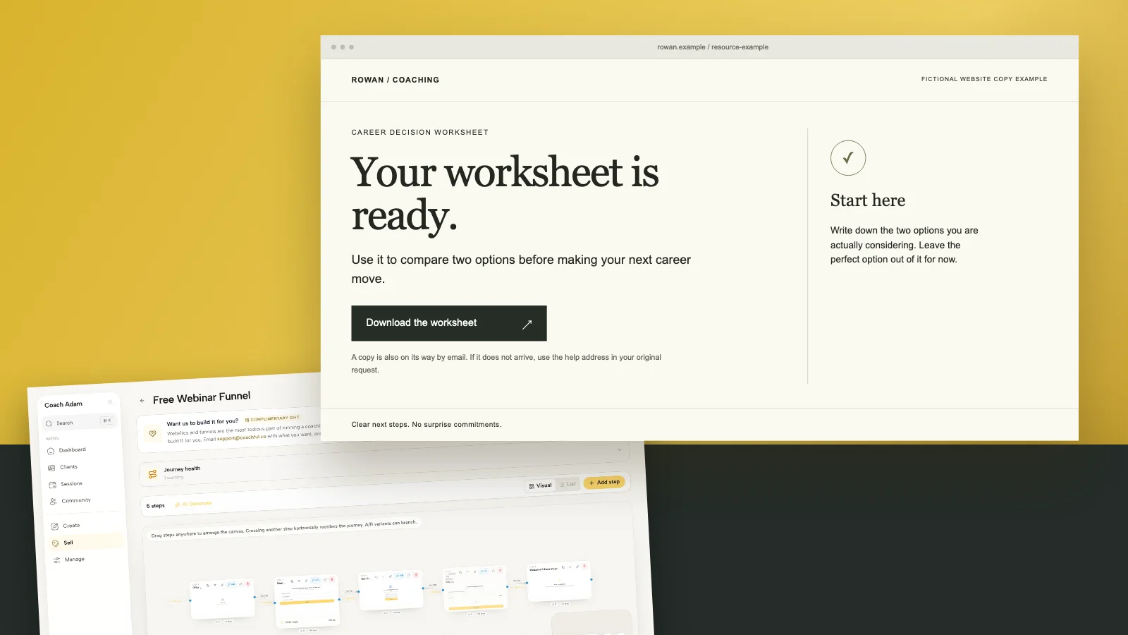
Your worksheet is ready.
Use it to compare two options before making your next career move.
Primary link: Download the worksheet.
A copy is also on its way by email. If it does not arrive, use the help address in your original request.
Start here: write down the two options you are actually considering. Leave the perfect option out of it for now.

Use the email sentence only if your actual process sends that copy. If delivery requires email confirmation first, say “Confirm your email to receive the worksheet” instead. Do not promise an immediate download while showing only a request to check an inbox.
The small starting instruction matters because receiving a PDF and using it are different things. Give one proportionate suggestion drawn from the resource itself. Avoid turning a simple download into a second assignment with a video, a survey and three more forms.
A quieter secondary link can explain how your coaching relates to the worksheet. For example: “If comparing the options raises questions you want support with, read how the career-decision session works.” Keep that optional. The worksheet must remain available without booking.
Trade-off: putting the download on a public page can make it shareable. That may suit a freely distributed resource. It does not suit confidential material or content whose access you have promised to restrict. Choose the delivery method intentionally rather than treating an obscure URL as protection.

Review the on-page promise and the actual delivery email together. If the page names one worksheet and the email sends an old version with a different title, the experience is not finished. Check the sender, resource link and relevant follow-up permissions. A visible sequence in an editor is not proof of successful delivery.
2. Coaching application: confirm receipt, not acceptance
Use this when: you review suitability before offering a call or a place. The applicant needs to know that their effort reached you and whether they should do anything else. They do not need an invented congratulations message implying a selection decision.
Application received. Not yet a reserved place.
Thank you for telling me about your goals. I will review your application and email you within [your actual response window].
If a conversation is the appropriate next step, the email will explain how to arrange it. Applying does not commit you to coaching.
Primary link: Read how the review works.
If you need to correct your contact details, use [your monitored correction route]. Please do not submit the entire application again.

The specimen uses two working days to demonstrate specific copy, not to prescribe a response standard. Replace it with a window your practice can maintain. If an assistant reviews initial requests, describe that honestly instead of promising a personal review you will not perform.
Choose the booking route according to your real process. If every applicant can immediately book a screening conversation, say so and offer the correct calendar. If you review first, do not show a calendar that bypasses the review and then cancel appointments afterward.
You can briefly explain the review criteria, such as relevant goals, scope and availability. Avoid presenting your decision as an assessment of someone’s worth or readiness to change. A coach declining an unsuitable engagement is making a service decision, not diagnosing the applicant.
Trade-off: offering a call immediately can remove waiting, but it also commits calendar time before review. Neither route is universally better. The page should reveal the route you genuinely operate, including whether an application fee exists. It must not introduce a previously undisclosed payment.

Keep the receipt page discreet. Do not echo someone’s health history, workplace conflict or private relationship details onto a page they might open on a shared screen. Confirm the application without repeating its sensitive answers. Detailed intake and appropriate records belong in the agreed process.
3. Webinar registration: help the person attend
Use this when: registration for a coaching workshop or educational webinar has actually completed. The next useful action is usually remembering and accessing the event, not filling in another qualification form.
Registration confirmed.
Your confirmation email contains the session time, time zone and joining instructions.
Primary link: Add the workshop to my calendar.
Bring one question: which career decision are you postponing because you want certainty first?
If the email does not arrive, use [your registration support route]. Do not register again just to request help.

Include the actual date, time, time zone and duration in live text on the finished page, not only inside the calendar file. The fictional specimen leaves them to the confirmation email because it is not promoting a real event. Your production page should remove that extra uncertainty.
Open the calendar link yourself. Check the event title, start and end times, time-zone handling and joining details. A button labeled “Add to calendar” that opens your own administrative calendar is a broken handoff, however polished the page looks.
If a replay is included, state the real arrangement. “A replay will be available” does not mean access forever. If there is no replay, say that before registration as well as afterward. Do not use the thank-you page to reveal a condition that should have informed the decision to register.
Trade-off: a preparation question can make attendance more purposeful, but mandatory homework may be disproportionate for a short introductory event. Keep preparation optional unless you disclosed it as part of the workshop. Do not collect personal coaching disclosures in a public comment thread.
4. Discovery-call booking: confirm the actual appointment
Use this when: the booking system has successfully reserved a time. If someone has only requested an appointment, replace “booked” with “requested” and explain the approval step. Do not let enthusiastic copy outrun the booking record.
Your introductory call is booked.
Your appointment is [date] at [time and time zone], by [the actual meeting format]. The confirmation email contains the joining instructions and booking details.
Primary link: Review my appointment.
To prepare, bring one question about working together. You do not need to write a personal history.
If you need to change the time, use the rescheduling route in your confirmation and check the booking terms.
Use a real appointment-management link where your system supports one. Never put another client’s booking reference in a shared page template. If the confirmation page is generic and cannot safely display individual details, direct the person to their private confirmation rather than pretending the page knows their appointment.
Repeat the call’s actual purpose and fee when needed. A fit conversation is not a full coaching session. A paid first session is not a free discovery call. The thank-you page should reinforce what someone chose, not quietly redefine it after booking.
Trade-off: a brief preparation prompt can help focus the conversation, but a long compulsory intake may create a new barrier after someone thought the booking was complete. Request only what you genuinely need and explain where sensitive information belongs.

For a full page-building project, our coaching website CTA examples address the invitation before the click. This confirmation page has a different job: proving that the promised booking actually happened.
5. Paid enrollment: put access ahead of the upsell
Use this when: successful payment and the relevant enrollment or order state have been verified. A browser arriving at a URL is not, by itself, proof of a payment. Use the trustworthy confirmation supplied by your payment and enrollment process.
Your enrollment is confirmed.
You have joined [the exact program or package]. Your receipt and access instructions are being sent through [your actual delivery process].
Primary link: Open my program.
Your first step is [one accurate starting action]. The live session dates and support arrangements are available in [their actual location].
If access does not work, contact [your monitored support route] with a brief description. Do not send card details or passwords.
Use that version only when the purchase really grants immediate program access. For a deposit, say “Your deposit has been received” and explain the remaining steps and balance arrangement already agreed. For a request awaiting approval, do not announce enrollment. For a pending payment, describe the pending state.
Do not expose private access through a universally shared thank-you URL. A public page can explain where to sign in; the actual content should respect the access arrangement you sold. Test as a new purchaser, not only as the account owner who can see everything.
Trade-off: a relevant additional offer can exist, but it must not displace the thing someone just bought. Make receipt, access, support and next steps unmistakable first. An anxious new client should not have to decline an upsell to discover where their program lives.
Build the handoff, not just the page
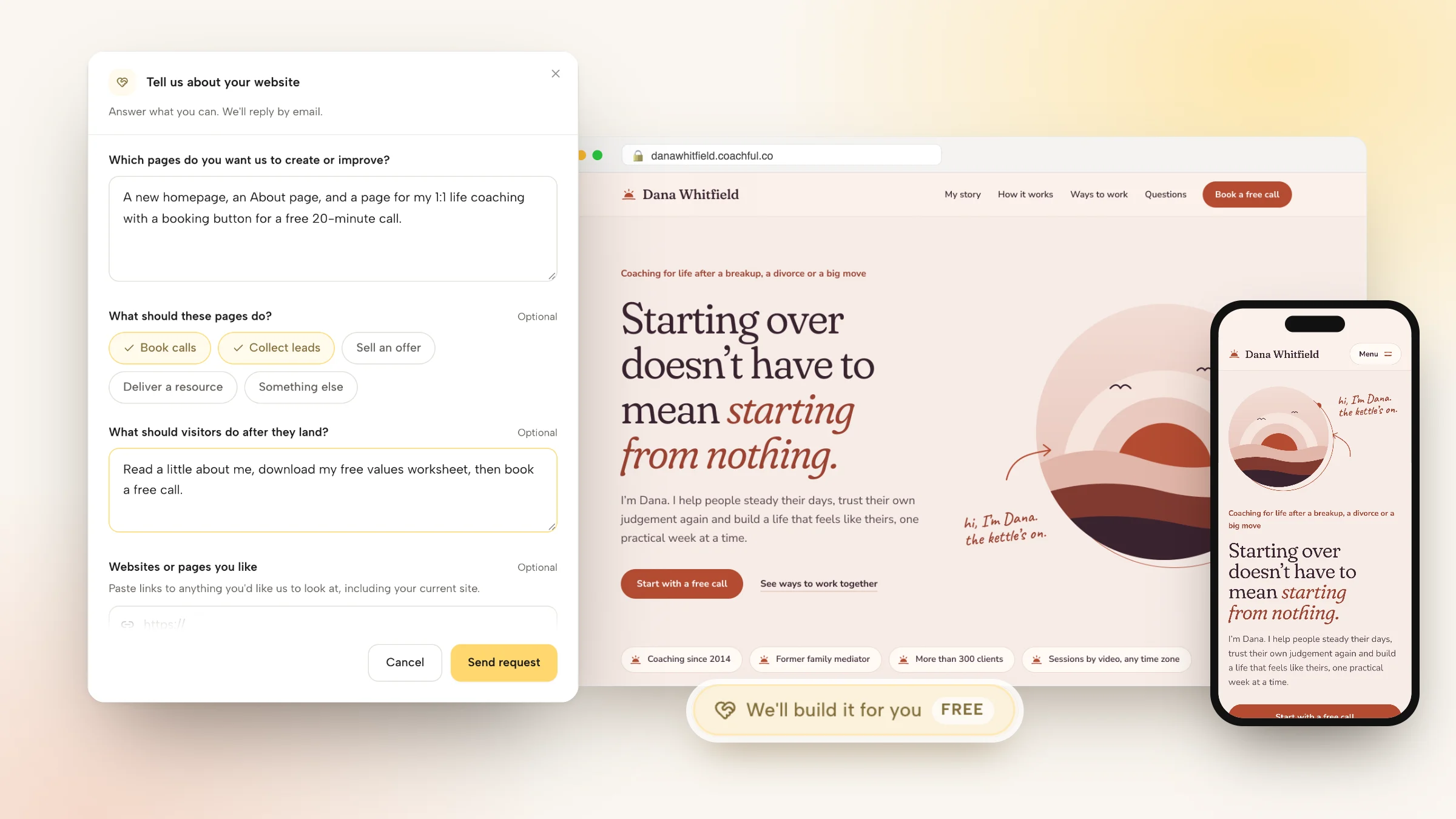
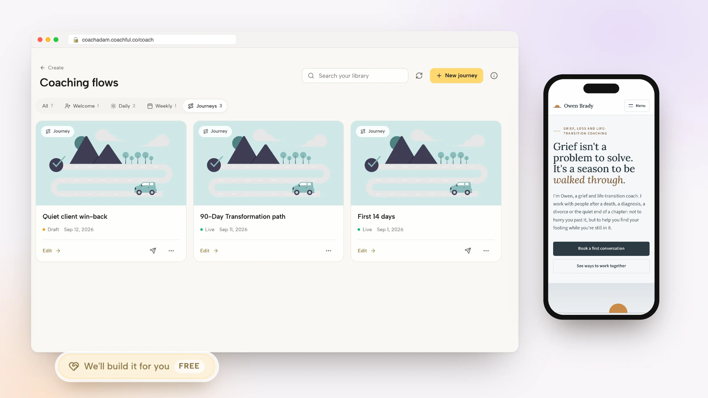
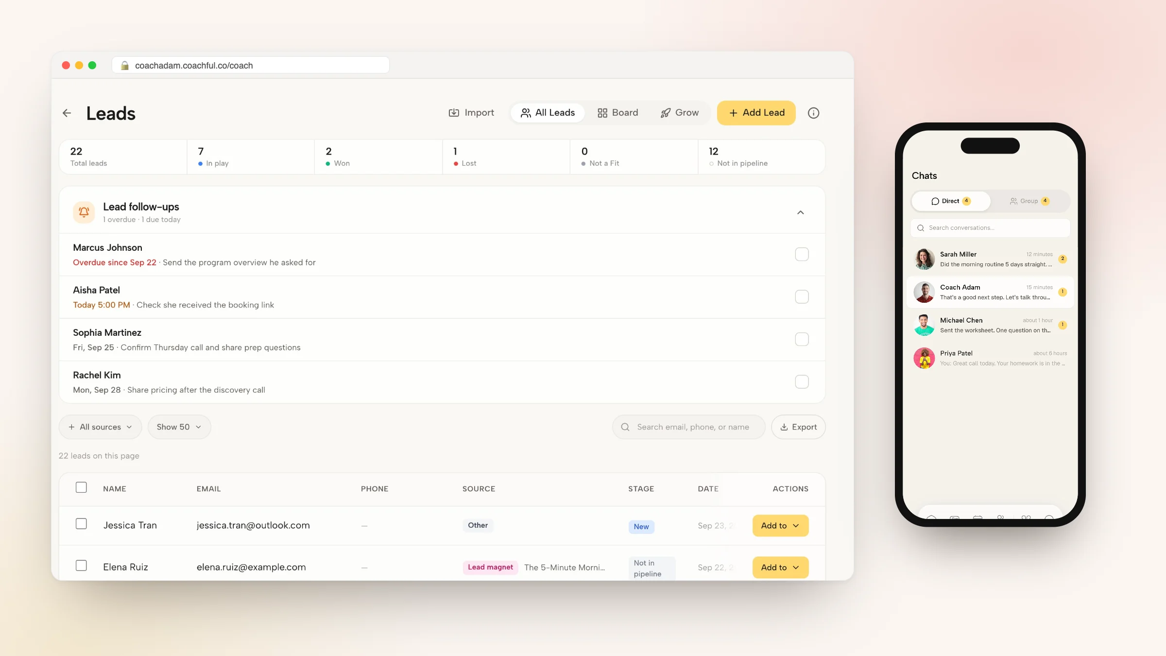
The screenshots in this guide show real Coachful demo workspaces for websites, forms, funnels, email sequences and public links. They illustrate surfaces you can inspect when designing the journey. They do not establish that your account already connects every step, delivers an email, validates a payment or grants access automatically.

Write a short handoff specification before configuring anything: “After this event succeeds, show this confirmation, deliver this item through this route and let the person take this next action.” Name who checks failures. That is more useful than telling an assistant to “make a high-converting thank-you page.”
For application review, assign an actual reply owner. For resource delivery, maintain the destination file. For events, update changed dates in the relevant confirmation and calendar route. A thank-you page is a promise about operations, so someone must own the operations it describes.
Test these seven things before publishing
- Success state: submit a realistic test and confirm the underlying record exists.
- Failure state: check that an incomplete or failed action does not show a successful receipt.
- Primary destination: open the download, calendar, appointment or access route while signed out where appropriate.
- Email: verify actual receipt in an external test inbox, not just an editor preview.
- Mobile and accessibility: check headings, readable instructions, keyboard access and meaningful link labels. Use text as well as a tick or color.
- Privacy: remove personal answers, private access tokens and unnecessary details from shared pages and URLs.
- Recovery: test the help route and ensure someone monitors it.
For measurement, distinguish a page visit from the completed event. Someone can refresh a thank-you page, bookmark it or arrive through a shared link. Those visits should not automatically become multiple new applications or purchases. Review the event data your setup actually provides before drawing conclusions.
With a small audience, use the failed handoffs you observe as practical evidence. A broken download or incorrect time zone deserves attention without waiting for a statistically persuasive conversion test. Do not advertise a measured improvement unless you have measured it.
Frequently asked questions
Should every coaching form have its own thank-you page?
No. A clear inline confirmation can be enough for a short enquiry. Use a dedicated page when the person needs delivery, preparation, access instructions or a meaningful next action. Different completed events often need different messages even when the design is shared.
Should I put a discovery-call link after a free download?
You can offer it as a secondary, optional step when it relates naturally to the resource. Deliver the download first. Do not imply that requesting a worksheet booked a call, established coaching suitability or required permission for unrelated marketing.
Can I use the same page after an application and a purchase?
Not without accurately distinguishing the states. An application confirms receipt; a purchase may confirm a transaction and access entitlement. A generic “Welcome aboard” message can mislead both groups. Reuse the visual structure if useful, but write event-specific copy.
Does a thank-you page need video?
No. A short orientation video can help with a complex next step, but keep the essential confirmation, instructions and links in live text. People should be able to finish the task with the sound off, images unavailable or no time to watch.
Fix your most important confirmation first
Choose one real action a prospective or paying client takes this week. Complete it as a stranger would, then ask whether the next page accurately confirms it, fulfills the promise and explains the next step. Fix that route before designing five new pages.
If you want to inspect the website, form and funnel workspaces shown here before deciding how to build your handoff, Try the interactive demo. Use fictional details, then return to your own setup and verify the completed event, destination and delivery rather than assuming a polished screen proves they work.
Sources and boundaries: Leadpages’ thank-you-page examples provide context for confirmation and subsequent actions; they do not validate the wording or performance of these five examples. The copy, selection rules and testing checklist are original editorial guidance, not legal advice or conversion benchmarks. Real Coachful screenshots contain demo data. The three website specimens are fictional designs, not customer sites or fabricated product interfaces.