Call to Action Examples for Coaches: 5 Website CTAs

Nour
Founder, Coachful
Should your coaching website say “Book a call”, “Apply now” or something less demanding? Choose the action the visitor can sensibly take next, then make the button name that action. Someone comparing coaching formats needs different information from someone who has already read your package and wants to start.
The best coaching CTA is an accurate invitation, not a more exciting verb. “Start your transformation” might sound important, but it does not tell a visitor whether they will see a calendar, complete an application or pay. Specific wording removes that uncertainty.
This guide gives you five call to action examples for coaches, with supporting copy, the right destination and the trade-off behind each choice. They are original examples to adapt, not tested winners or promises of more bookings. Use only the durations, prices, availability and services that are true for your practice.
Choose the CTA by the decision, not by the coaching niche
A life coach and an executive coach can use the same button when the next step is the same. Two career coaches may need different buttons because one sells a defined workshop directly and the other screens applicants before offering an engagement.
Start with this selection rule:
- The visitor does not yet understand your services: show the packages or explain the approach.
- They understand the offer but need to assess fit: invite an introductory conversation.
- You must review suitability before offering a place: invite an application.
- They want a useful resource before considering coaching: offer that specific resource.
- They have the details and can purchase appropriately: name the program and the enrollment action.
These are five alternatives, not five buttons to place side by side in your hero. Give a focused service page one primary next step. A homepage serving several genuinely different audiences can have clear routes to relevant pages without making every action equally prominent.

1. “See coaching packages” for visitors comparing their options
Use it when: the visitor needs to understand how working with you is structured before booking a conversation. It suits a homepage or an introductory article where the reader has not yet seen the available services.
Supporting copy: “Choose between a focused career-decision session and a longer coaching package. See the format, what is included and how the first step works.”
Button: See coaching packages
Destination: a service comparison or package page, not an unexplained calendar.
The destination needs to earn the click. Explain who each option suits, its scope, session format, support boundaries and price or pricing process. If there is only one package, use “Explore the career coaching package” instead of pretending there is a choice.

The trade-off: this adds an information step before a call or purchase. That can be appropriate when visitors otherwise book the wrong service. It is unnecessary when an offer page already explains the single package and the person is ready to take its next step.
Avoid replacing every concrete label with “Learn more”. That phrase can work when surrounding copy makes the destination obvious, but “See coaching packages” is easier to understand when links are scanned out of context. Name what the visitor will learn about.
For a coach selling to both individuals and employers, separate the routes meaningfully: “Explore private coaching” and “Discuss a team program”. Do not send both audiences into the same form and hope the administrator sorts out the mismatch later.
2. “Book an introductory call” when the next decision is fit
Use it when: a conversation helps both parties decide whether coaching is appropriate. The call can be free or paid, but its purpose, length and cost should be explicit before someone chooses a time.
Supporting copy: “A 20-minute video conversation to discuss what you want support with and whether my coaching approach fits. There is no charge and no obligation to continue.”
Button: Book an introductory call
Destination: the booking page for that exact call type.
The duration and free-call wording above are hypothetical. If your first conversation is paid, state the actual fee. If it includes a discussion of your services, do not advertise “no sales conversation” and then deliver a pitch. Low pressure should describe the experience, not conceal its commercial purpose.
If the visitor must complete a form and wait for approval before seeing availability, “Request an introductory call” is more accurate than “Book”. Say when you expect to review the request. A form submission is not a confirmed appointment.
The trade-off: a call creates time commitments for both people. Do not make it the compulsory route to a simple resource or a clearly specified product merely because your website template came with a calendar button. Conversely, do not send an uncertain prospect to payment when suitability still needs discussion.
Keep the booking destination consistent with the invitation: same call name, same length, same fee and a clear confirmation. Our coaching booking page guide covers the page itself. The decision here is whether a booking is the right action at this point.

3. “Apply for the leadership cohort” when selection happens first
Use it when: you genuinely review applications before offering places. This may suit a group with prerequisites, a defined audience or a delivery model that needs a suitability check. An application should exist because the decision needs it, not to make an ordinary purchase feel exclusive.
Supporting copy: “For new managers considering the next leadership coaching cohort. The application asks about your role, goals and availability. I review it before inviting a fit conversation; applying does not reserve a place.”
Button: Apply for the leadership cohort
Destination: the application with the program details available nearby.
Tell applicants what happens after submitting: who reviews the form, the expected response period, whether a call follows and whether a fee is involved. Use a response period you can maintain. Avoid an unexplained “We will be in touch” when someone is planning around dates.

Ask only what informs the selection or next conversation. A coaching application is not permission to gather unnecessary health, family or employer information. Explain relevant privacy arrangements and keep optional marketing choices separate from applying.
The trade-off: an application asks for more effort and can discourage suitable people if it feels disproportionate. If you accept everyone who meets simple published conditions, a long application may create work without improving the decision. Consider a direct registration or a shorter enquiry route instead.
Use real capacity language only. “Apply for one of six places” is appropriate only when six is the actual cap. Do not add a small number to a self-paced product with no such limit, and do not imply application review guarantees a place.
4. “Get the career decision worksheet” for an educational next step
Use it when: the visitor wants help with a specific question but is not yet deciding to hire a coach. A relevant worksheet, checklist or short lesson can offer a proportionate next step from an educational article.
Supporting copy: “A short worksheet to compare the options you are considering and prepare questions for your next conversation. Enter your email to receive the worksheet and the follow-up messages described below.”
Button: Get the career decision worksheet
Destination: the resource request form or the resource itself, depending on your stated arrangement.
Name the actual resource. “Get clarity” describes an aspiration; “Get the career decision worksheet” describes what you deliver. If it is an immediate download without email, “Download the worksheet” is accurate. If delivery is by email, explain that before submission.
Be transparent about any continuing emails. Delivering a resource and subscribing someone to an ongoing newsletter are not automatically the same permission. Set up the request and optional marketing choices in line with the rules that apply to your business, and honour withdrawals.

The trade-off: resource interest can be broader than buying intent. People may find the worksheet useful and never want coaching. That is not deception or failure; it means the action did what it said. Do not count every download as a future client.
Choose a resource that helps with a real part of the problem your coaching addresses, rather than an unrelated freebie that attracts people you cannot serve. Avoid diagnostic claims, guaranteed results or a resource title implying medical or financial expertise you do not hold.
5. “Enroll in the next group” when the purchase decision is ready
Use it when: the visitor has enough information to make an appropriate purchase, and no undisclosed approval step remains. Name the specific program or cohort where that makes the action clearer.
Supporting copy: “Review the session dates, package inclusions, total fee and cancellation terms below. If the format fits what you need, continue to the enrollment and payment page.”
Button: Enroll in the next group
Destination: the relevant enrollment or checkout, with the same offer and terms.
If your button starts a paid transaction, do not disguise it as a free exercise or an application. The checkout must clearly show what the person is buying and any recurring commitment. Applicable requirements for the final payment button can differ by jurisdiction; check the wording your checkout needs.
The trade-off: direct enrollment can be simpler for a well-defined offer, but it is not a substitute for suitability checks where those are needed. Price alone does not determine whether a call or an application is necessary. The service, client circumstances and professional scope matter too.
A named cohort needs real dates, availability and conditions. If the group requires a minimum enrollment, explain what happens if that minimum is not met before accepting payment. If there is no upcoming group, use an honest interest-list route rather than a checkout for delivery you have not decided to provide.

Write the sentence around the button
A button cannot carry the entire explanation. Use a short sentence above or below it to answer the uncertainty most likely to stop an appropriate action: time, cost, review, delivery or commitment.
- Booking: “Twenty minutes by video, no charge, no obligation to continue”, only if all three are true.
- Application: “I review applications before offering a call. Applying does not reserve a place.”
- Resource: “Delivered by email. See the form for the messages you are choosing to receive.”
- Enrollment: “Check the dates, full fee and cancellation terms before continuing.”
- Package comparison: “See the format and inclusions before deciding whether to speak.”
Keep important conditions in live text. Tiny lettering inside an image is not a reasonable place to reveal a fee, an ongoing subscription or a screening step. Likewise, a disclaimer at the bottom of a different page does not fix a misleading invitation.

Test the handoff before testing button colors
Open your page as someone who has never met you. Read only the headline, supporting sentence and button. Predict what the click will do, then click. If the destination contradicts that prediction, fix the journey before polishing the copy.
Run the same check on a phone. Confirm the label is readable, not clipped and not covered by a floating banner. Check that the button is reachable by keyboard, has a visible focus state and can be understood without relying on its color alone.
For navigation to another page, use a real link styled as a button. For submitting a form, use the appropriate form control. Your website builder may handle those semantics, but you should still test the resulting page. A graphic that merely looks like a button is not enough.
Repeat the primary invitation after useful information when that saves scrolling. Keep the wording consistent where the action is identical. Change it only when the action changes, such as “See packages” leading to information and “Book an introductory call” leading to an appointment.
Measure suitable next steps, not just clicks
Track the chain you actually need: relevant visits, CTA clicks, completed forms or bookings, suitable conversations and appropriate purchases. A high click count can conceal a destination that people abandon or a promise attracting the wrong enquiries.

In the hypothetical comparison shown, one version receives twenty clicks and two qualified enquiries from one hundred visits. Another receives twelve clicks and five qualified enquiries from one hundred visits. The second has fewer clicks but more suitable enquiries. These are invented teaching counts, not a study, benchmark or Coachful outcome.
With a small coaching practice, a handful of visits rarely settles an A/B test. Review the actual enquiries, ask what people expected and change one material element at a time. Do not call a new phrase a winner because one person booked after you changed it.
Frequently asked questions
What is the best call to action for a life coach?
The one that accurately names the next appropriate action. An introductory call suits a fit conversation; a package link suits someone comparing services; an enrollment link suits a visitor ready to buy a defined offer. The specialty does not create a universal winning phrase.
Should I use “Book a call” or “Apply now”?
Use “Book” when the visitor can actually confirm an appointment. Use “Apply” when you review suitability before deciding the next step. If a request needs approval before booking, say “Request a call” and explain the review process.
Can I have two CTAs on my coaching homepage?
Yes, when they serve distinct, understandable needs. Make the primary route visually clear and keep the secondary route useful, such as information about how coaching works. Avoid giving unrelated actions equal prominence without explaining who should choose each.
Do stronger words increase coaching conversions?
No phrase guarantees that. Clear wording helps set expectations, but fit, the offer, the destination, trust and practical availability also affect decisions. Measure suitable completed actions rather than assuming more dramatic language will produce better clients.
Fix one invitation from start to finish
Choose your most important page. Write down the decision it should help someone make, select one of the five CTA patterns and test its destination and confirmation. You do not need to rewrite the entire website to discover whether “Book” currently means “Submit a form and wait”.
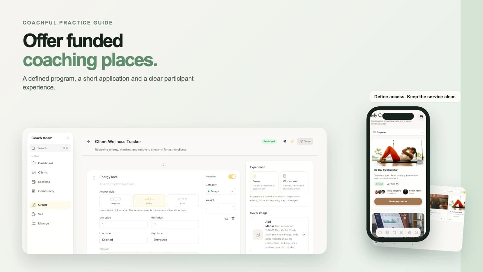
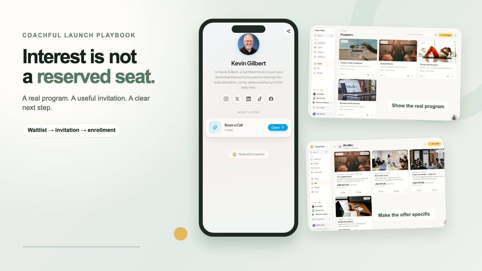
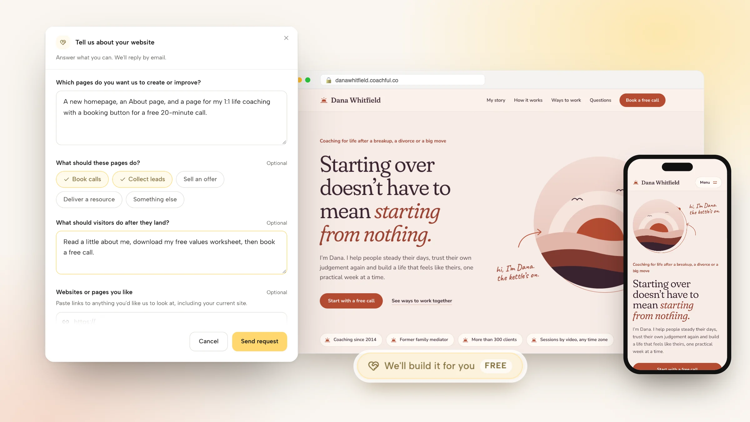
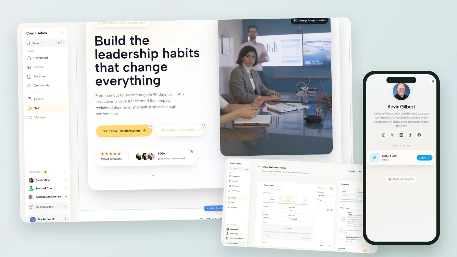
If you want to inspect the page, form and follow-up side before changing your setup, Try the interactive demo. Use fictional details and compare the website, form and funnel workspaces illustrated here with the journey you need. These are real demo screens, not a claim that the sample CTAs or a complete connected funnel are already configured for you.
Sources and boundaries: The Good Alliance’s coaching CTA guide illustrates form-first and calendar-first routes. It provides context for the handoff decision, not evidence that a particular phrase increases bookings. The five examples and decision rules above are original editorial guidance, not experimentally validated wording. All screenshots contain demo data. For the broader page-writing task, use our coaching sales page guide.