Coaching Website Design: Layout, Type, Color and Photos
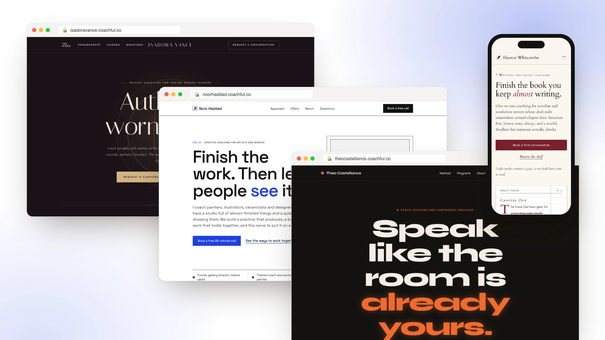
Good coaching website design makes one thing obvious: what the right visitor should do next. Layout decides where the eye goes, typography sets the tone before a word is read, color marks what can be clicked, and photography tells people whether you're someone they'd talk to. When those four choices all point at the same button, the design is doing its job, whatever it looks like.
This guide covers each part of coaching website design with the decisions spelled out: a one-page design brief, the first-screen layout, type and color choices, photos, the conversion details that move people to book, and what changes on a phone. The examples are Coachful's designed homepage templates, each drawn for a fictional coach in a real niche. If you would rather hand the design to someone, Coachful's team builds coaching websites for free on every plan; send your brand colors, fonts and a few sites you like, and they do the rest.
What coaching website design is really deciding
A coaching website is read by someone deciding whether to trust a stranger with something personal. Design answers two silent questions before the copy gets a chance:
- "Is this for someone like me?" A calm sage page with a serif headline says something different from a black page with acid-green condensed type. Neither is better. One of them is right for burnout recovery and the other for strength training.
- "What am I supposed to do here?" If three buttons look equally important, the visitor picks none of them.
So treat every design choice as an answer to one of those two questions. If a choice doesn't help either one, it's decoration, and decoration is fine as long as it never competes with the button.
Start with a design brief, not a palette
Most coaches start by choosing colors, which is like choosing curtains before you know which room they're for. Answer these six questions first. They take twenty minutes and make every later decision easier.
| Brief question | Example: burnout coach | Example: executive coach |
|---|---|---|
| Who is the visitor, in one line? | A doctor or lawyer running on empty | A chief executive between board meetings |
| How should they feel in the first five seconds? | Calmer than before they arrived | That this person is discreet and senior |
| What is the one action? | Book a quiet call | Request a conversation |
| What proof do you have today? | Background, method, confidentiality | Years leading teams, named sectors |
| What photos do you have? | None yet | A professional portrait |
| Three sites you like, and why? | Slow pacing, lots of white space | Fine lines, restrained type |
The answers point straight at a design. The burnout coach needs soft color, generous spacing, an illustration instead of photos and a gentle button label. The executive coach needs precise type, very little color and a contact path that doesn't feel like a sales call. Tidewater and Atelier, two of Coachful's templates, are built on exactly those briefs.

Layout: the first screen and the scroll
The first screen of a coaching website follows a layout that's hard to beat, and almost every one of Coachful's 30 templates uses a version of it:
- A slim top bar. Your name or logo on the left, three or four menu links, and the main button on the right, styled differently from the links.
- An eyebrow. A short line in small capitals naming the niche: "Somatic and mindfulness coaching".
- The headline, large enough to read from across a room.
- One or two sentences on how you help.
- A filled main button and a quieter text link, side by side.
- A visual on the right, or centered below on calm, symmetrical layouts.
- A proof strip along the bottom edge: three or four short facts.
Then the scroll answers questions in the order a visitor asks them: the problem in their words, how it works, what you offer, who you are, what clients say, a free resource for people who aren't ready, a FAQ and a closing button.
Three layout details make a big difference:
- Line length. Keep paragraphs to roughly 45 to 75 characters per line, a range typographers have recommended for decades. Full-width paragraphs on a large screen are tiring to read.
- Spacing. Generous space around the headline and between sections reads as calm and confident. Crowding reads as anxious.
- Alternating backgrounds. A slightly different background on every other section helps people see where one idea ends and the next starts, without lines or boxes.
Sanctuary, above, centers everything and slows the pace with an arched image below the buttons. Meridian and Atelier use thin rules and numbered sections instead, which suits a reader who scans like an executive reads a board pack.
Typography for coaching websites
Two typefaces are enough: one for headlines, one for everything else. The headline face carries the personality; the body face just needs to be easy to read.
| Type style | How it feels | Coachful templates that use it | Suits |
|---|---|---|---|
| Classic serif headlines | Warm, literate, trustworthy | Hearth, Harbor, Sanctuary, Quill | Life, grief, wellness, writing coaches |
| Refined high-contrast serif | Senior, quiet, expensive | Atelier, Meridian, Editorial | Executive coaches, leadership and career strategists |
| Heavy condensed sans | Energy, effort, speed | Kinetic, Pulse, Summit | Fitness, running and performance coaches |
| Monospace labels with bold sans | Precise, technical, no-nonsense | Monolith, Circuit | Coaches for founders and engineers |
| Rounded friendly sans | Approachable, clear, low-pressure | Cove, Prism | Parenting and ADHD coaches |
One device shows up across many of the templates: a single word or phrase in the headline set in italic or in the accent color. "You were never meant to live at this speed." "You don't need to be fixed. You need room to recover." It gives the headline a voice and a place for the eye to land. Use it once per headline, not three times.
For body text, set paragraphs around 16 to 18 pixels with comfortable line spacing, and never go below 16 pixels on form fields: iPhones zoom into smaller inputs, which jolts the page just as someone starts typing their email.

Kinetic shows how far type alone can carry a brand. There is barely an image on the first screen: giant condensed capitals, one word in acid green and a moving ticker of facts ("45 minutes each", "Retested every 4 weeks").
Color: one accent, used only for action
The simplest color system for a coaching website has three parts: a background, a text color and one accent. Use the accent for buttons and links and almost nothing else. When the accent appears only where something can be clicked, visitors learn the rule in a second.
- Background: a warm off-white, a soft tint or a deep dark, chosen from your brief's feeling.
- Text: near-black on light backgrounds, warm off-white on dark ones.
- Accent: one color with strong contrast against the background.
Check contrast. The Web Content Accessibility Guidelines ask for a contrast ratio of at least 4.5:1 for normal text and 3:1 for large text. Pale gray text on white, a common choice on "minimal" coaching sites, often fails, and plenty of your visitors will be reading on a phone in sunlight.
Dark designs work well for luxury and energy: Velvet's aubergine and champagne for senior women leaders, Northstar's navy starfield for career transitions, Kinetic's black and green for strength coaching. Light, warm designs suit calm and care. Neither is a rule. A parenting coach could use a dark theme; it would just need a reason in the brief.

Color can carry meaning, too. Ledger, drawn for money coaches, keeps the palette to ruled paper, ink and a bank-note green, and lets tabular numbers in a sample monthly budget do the visual work.
Photography and illustration
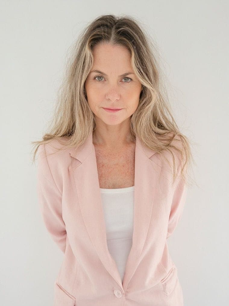
A coaching website needs one good photo of you more than it needs anything else visual. Visitors are deciding whether to talk to you, so let them see you.
- Natural light, eye contact, chest-up. A window and a recent phone is enough; studio lighting isn't required.
- Dress the way you coach. If sessions are relaxed video calls, a suit looks like someone else.
- Use the same photo style everywhere. Two very different portraits on the homepage and About page look like two people.
- Skip the stock clichés. Mountaintops, handshakes and people jumping on beaches are what visitors scroll past. If you do need stock, pick it carefully.
- Compress images. A large hero photo straight from a camera can slow a page badly on mobile data.
Illustration is a strong alternative when you don't have photos yet, or when the subject is private. Coachful's templates lean on it: a setting sun for life transitions, a single gold star for career direction, a lantern for purpose, waves for burnout recovery, a petal for fertility coaching. One simple, meaningful shape beats a collage. Later, add your portrait to the About section and the note from you on the homepage.

Gallery, drawn for coaches of artists and makers, turns the hero visual into a framed piece with a museum-style caption, "Untitled (beginning). Mixed media, 2026", which tells the right reader they're in the right place without a word of explanation.
Conversion design: make the next step obvious
Conversion design is the part of coaching website design that decides whether people book. Most of it is consistency:
- One primary button style. Filled, in the accent color, used only for the main action. Secondary actions become underlined text links. Nearly every Coachful template pairs a filled button with a text link for exactly this reason.
- The main button in the top bar. It stays visible as people scroll, so they never have to hunt for it.
- Repeat it. After the offers, after the testimonials and at the end of the page. Same label every time.
- Put proof next to the button. The proof strip sits directly under the hero buttons in most templates, so trust and action share a screen.
- Labels that say what happens. "Book a free 20-minute call" outperforms "Get started" because it removes a question.
- Keep forms short. Name, email and one question. Every extra field costs people.
- Booking on the page. A calendar embedded in the site keeps the visual promise intact; a jump to a differently styled tool breaks it.

Monolith shows that a loud style can still be disciplined about action. The top bar is a row of plain boxed labels in monospace, and the only filled box among them is the acid-green "Book a fit call".
Designing a coaching website for phones
A large share of coaching website visitors arrive from Instagram, LinkedIn or a text message, on a phone. Design the phone version on purpose rather than accepting whatever the desktop layout collapses into.
- Stack in order of importance: eyebrow, headline, sub-line, main button, secondary link, then the visual. On a phone, the image goes below the button, not above it.
- Full-width buttons. Easy to hit with a thumb and impossible to miss. Apple's design guidelines recommend tap targets of at least 44 by 44 points.
- Keep the main button next to the menu icon. Several templates, Meridian and Kinetic among them, keep a small booking button in the phone header beside the menu.
- Shorter headlines. A headline that's three lines on desktop can be seven lines on a phone. Check it, and cut words if needed.
- Test the booking flow on your own phone, from the first tap to the confirmation email.

Orchard's phone view is a good model: headline, two sentences, a full-width "Book a free call" button and a full-width outline button for the programs, before the illustration appears.
Coaching website design styles by niche
If you're unsure where to start, here is how Coachful's templates map to coaching niches. Use it as a starting point, not a rule.
| Niche | Template | Design in one line |
|---|---|---|
| Life and transition | Hearth | Warm and personal, with a handwritten letter and soft shapes |
| Grief and loss | Harbor | A horizon line, fog gradients and unhurried spacing |
| Burnout recovery | Tidewater | Layered waves, soft gradients and room to breathe |
| Somatic and mindfulness | Sanctuary | Arched frames, soft botanicals and slow pacing |
| Nutrition and health | Orchard | Fruit-like circles, leaf arcs and a plated approach |
| Career transition | Northstar | A starfield hero, one gold star and a compass-rose method |
| Executive and leadership | Meridian | Wide rules, a numbered agenda and brass hairlines |
| Executive advisory | Atelier | Quiet luxury: fine rules, precise type and generous space |
| Business coaching for creators | Studio | Bento tiles, pastel blocks and stickers |
| Founders' operations | Scaffold | Drafting lines, dotted callouts and offers laid out as phases |
| Fitness and strength | Kinetic | Dark, bold and fast, with giant type and a moving ticker |
| ADHD and neurodivergent | Prism | Chunky rounded cards, big check marks and short lines |
| Money coaching | Ledger | Ruled paper, tabular numbers and offers as line items |
For the content side, page by page, see our complete coaching website guide, and for examples of real coaches' sites, the best coaching websites.
Coaching website design mistakes
- Accent color everywhere. When headings, icons and borders are all the button color, nothing looks clickable.
- Three fonts or more. It reads as indecisive, and it slows the page.
- Testimonials as images. A screenshot of a review can't be read by screen readers or search engines and is often blurry on phones. Set testimonials as real text.
- A slideshow hero. Rotating banners hide your message behind a timer. Pick one.
- Low-contrast "minimal" text. Light gray on white looks elegant in a mockup and unreadable on a bus.
- A desktop-only design review. If you only ever look at the site on a laptop, you haven't seen what most visitors see.
- Design that outruns the copy. A beautiful page with a vague headline still loses. Write the first screen before you style it.
Already live and not sure what's wrong? The coaching website audit checklist tests the first screen in a few minutes.
Designing your coaching website in Coachful
Coachful's coaching website starts from 30 designed homepages on five shelves (Business, Wellness, Performance, Creative and Life), each previewed at full desktop width and inside a phone frame before you choose. Fifteen template families include matching About, Services, Pricing, FAQ, Contact, Book a call and Newsletter pages, so the whole site keeps one design.
- Your logo and brand accent are applied to the template you pick.
- You edit words and links directly on the page, and any section you add between template blocks picks up the template's typefaces, accent and background.
- Navigation comes in glass, classic and minimal styles.
- Every Book a call button points at your booking flow, and each offer gets a page with checkout.
- Each page carries its own SEO title, description and social sharing image.

Applying a template creates a private draft filled with your business name, offers and links. Your current site stays live until you switch. More on the website builder, and on choosing a design for a life coaching practice in our life coach website examples.
Have the design done for you, free
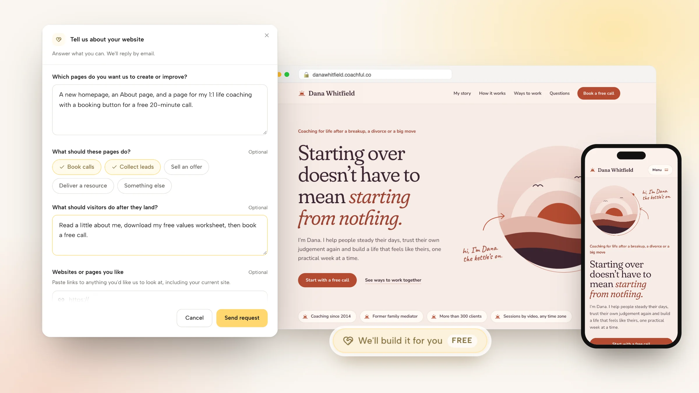
Coachful's team builds coaching websites for free on every plan, design included. Open Website and click Fill in a form on the "Want us to build it for you?" card, or choose We'll build it for you · FREE under Create.
For design, the most useful things to send are:
- Your logo and brand guide, if you have them, in the files section (up to 10 files).
- Your colors and fonts in the "Branding, copy, images or offers to include" box.
- Up to 8 links to sites or pages you like, with a word on what you like about each.
- Your current site, so the team can keep what works.
- Anything that feels confusing, broken or unfinished today.

The team replies by email with next steps, usually within about 24 hours, and builds the pages inside your account so you can change anything later. Recent requests show how far a brief can travel. A business mentor for beauty professionals got a sales page and checkout whose design came straight from her own free guide PDF. A somatic coach leaving Kajabi had the homepage and About page rebuilt from the old theme, with testimonials and numbers that had been images turned into real text. A life-purpose coach got three programs drawn as one pine at three heights, taken from the coach's emblem.
The team doesn't design logos, shoot photos, record video or run ads, and nothing is invented: no fake testimonials, credentials or prices. See everything the free build covers.
Frequently asked questions
What makes a good coaching website design?
A good coaching website design makes the next step obvious to the right visitor. It uses one accent color only for buttons and links, two typefaces, a real photo of the coach or one meaningful illustration, a proof strip near the main button, and a phone layout where the button comes before the image.
What colors should I use for my coaching website?
Start from how the visitor should feel, then pick a background, a text color and one accent for buttons. Calm niches often suit warm light backgrounds; executive and luxury coaching suit dark or very restrained palettes; fitness suits high contrast. Check that text meets the 4.5:1 contrast ratio in the accessibility guidelines.
What fonts are best for a coaching website?
Use two: a headline face with personality and a simple, readable body face. Serif headlines feel warm and trustworthy for life and wellness coaching, refined serifs feel senior for executive work, and heavy condensed sans suits fitness and performance. Keep body text at 16 to 18 pixels.
Do I need professional photos for my coaching website?
No. A well-lit, recent photo of you with eye contact is enough, even from a phone. Until you have one, a simple illustration that represents the change you help with works well; many of Coachful's templates use one instead of photos.
How do I design a coaching website that works on mobile?
Stack the headline, sub-line and full-width main button before any image, keep a booking button in the phone header, check that the headline isn't seven lines long, and use form fields of at least 16 pixels. Then book a call on your own site from your phone.
Can I hire someone to design my coaching website for free?
Coachful's team builds and designs coaching websites for free on every plan. Send your logo, colors, fonts and links to sites you like through the website form, and the team replies with next steps, usually within about 24 hours. Coachful is a paid subscription; the build costs nothing extra.
Should my coaching website look like other coaches' websites?
Borrow structure, not style. The first-screen layout (eyebrow, headline, sub-line, button, proof strip) works for almost every coach, but the type, color and imagery should come from your own design brief. A site that looks like everyone else's makes you easy to forget.