Coaching Website Accessibility Checklist: 7 Practical Checks

Coachful
Editorial Team
Can someone understand your coaching offer, ask a question and book a call without using a mouse or reading tiny text? Start your coaching website accessibility checklist there. Test the actual route from your homepage to confirmation, then fix anything that prevents a person from completing it.
A beautiful homepage is not enough if its booking calendar traps keyboard focus or its enquiry form only explains mistakes in red. The prospect may leave before you ever learn that they wanted coaching. That is an access barrier, not evidence that your offer was wrong.
This guide gives coaches seven practical checks, a copyable issue report and a sensible order for repairs. It is a first review, not a complete WCAG audit, legal opinion or certification of Coachful or any other platform. The W3C explicitly warns that a page can pass easy checks and still contain significant accessibility barriers.
The short answer: test a task, not just a page
Choose one realistic task: “Read the career-coaching package, ask about an adjustment and request a consultation.” Write down every page, popup, form, calendar, payment step and confirmation it involves. Include third-party screens. A working homepage cannot compensate for an unusable handoff.
Run that task as a new visitor, outside your editor and without an existing login. Use a test identity you control. Do not send messages to real leads, reserve scarce appointments or make live charges just to check the journey. Use supported test modes where available.
Keep a simple record for each check: the URL, device and browser, task attempted, what happened, who owns the repair and whether you retested it. Record “not tested” when you have not tested something. A screenshot and a green automated score are not substitutes for evidence that a person can complete the task.
1. Complete the enquiry route using a keyboard
Put the mouse aside. Starting at the address bar, press Tab to move forward and Shift+Tab to move backward. Use Enter or Space where appropriate to activate controls, and arrow keys where the component expects them. Some browser and operating-system settings affect keyboard navigation, so check those before diagnosing a missing stop.
You should be able to identify the current focus, reach every necessary control and leave anything you open. Menus, cookie choices, contact dialogs, embedded players and date pickers deserve particular attention. Try to close each popup and confirm that focus returns somewhere sensible.
- Reach: Can you get to the primary consultation link, every required field and the submit action?
- See: Is the focus indicator visible on light and dark sections, not hidden behind a sticky header?
- Operate: Can you choose an option and activate the action without guessing where focus is?
- Leave: Can you exit a menu or modal rather than becoming trapped inside it?
A common coach-site problem is a calendar that looks excellent when clicked but behaves unpredictably with the keyboard. Report the exact date selector and step where it fails. “The booking page is inaccessible” gives a supplier much less to work with than “After opening the month selector, Tab cannot reach the available times.”

Do not fix a focus problem by removing the visible outline because it clashes with your brand. Ask for a usable focus treatment. If the broken control belongs to an embedded provider, send that provider a reproducible report and offer a practical alternative contact route while it is repaired.
2. Measure contrast and stop relying on color alone
Check ordinary text against its actual background, including captions, form instructions, prices and quiet footer links. Under WCAG’s minimum-contrast criterion, normal text generally needs a ratio of at least 4.5:1. Large text generally needs 3:1; the large-text definition includes 18-point regular or 14-point bold text. Relevant exceptions exist, including logotypes and incidental text.
Use a contrast tool rather than judging by eye. A photo, gradient or transparent overlay can change the background behind each word. Sample the combinations people actually encounter, not merely the two colors listed in your brand guide.

Color must not carry the entire instruction. If an invalid email address receives a red border, add a clear message such as “Enter an email address in the format name@example.com.” If two packages use different colors, give them distinct names and explain their differences in text.
For a coaching business, this is often an editorial repair as much as a design repair. Put “Required” beside the necessary field. Say “Registration closes on [actual date]” instead of expecting a red dot to convey urgency. Avoid using a pale, disabled-looking label for something the reader still needs to understand.
Measure interface components and important graphics against the applicable requirements too. Passing the paragraph-text check does not establish that input boundaries, controls or focus indicators are usable.
3. Make headings, links and images meaningful
A visitor using a screen reader may navigate by headings or links rather than reading every sentence in order. Give each page a descriptive title, make its main purpose clear, and use real heading structure for sections. Enlarging or bolding a paragraph does not automatically make it a heading.
Your offer page might use a main heading naming the service, followed by sections for who it suits, what is included, the commitment, fees and the next step. Keep that structure understandable when read without the layout. Do not choose heading levels merely to obtain a preferred font size.

Use link wording that explains the destination. “Read the six-session career-coaching package” is more useful than several unrelated links all called “Learn more.” A button’s accessible name should identify its action, and its visible wording should not contradict what assistive technology announces.
Write alternative text according to an image’s job. A purely decorative background can have an empty alternative. An informative diagram needs an equivalent explanation. A linked image needs an accessible name that communicates the link’s purpose. Do not stuff coaching keywords into descriptions of decorative photographs.
For example, a fictional package comparison image should not have only “coaching packages” as its alternative. Put the session counts, support boundaries and prices in live text beside it. That also helps people who enlarge the page, block images or cannot comfortably read text baked into a graphic.
4. Test forms with missing and incorrect answers
An enquiry form needs more than attractive fields. Each control needs a clear label associated with it, instructions before they are needed, and understandable feedback when something goes wrong. A placeholder that disappears as someone types is not a dependable substitute for a persistent label.
Submit the form empty using your test identity, then try an invalid email format or another safe incorrect value. Can you identify what needs fixing? Does the form retain the answers you already supplied? Can you reach the error and correct it without a mouse? Check how errors are conveyed with assistive technology as well as visually.

Keep your wording specific and proportionate. Instead of “Invalid input,” use “Choose a consultation type before continuing.” Instead of demanding an explanation of someone’s disability, offer an optional route to discuss an adjustment. Ask what would help them take part, not for a diagnosis you do not need.
A useful fictional field is: “Is there an adjustment you would like to discuss before booking? Optional. You can also contact [monitored address]. Please share only what you are comfortable sharing.” Replace the address and confirm who reads these requests. Do not promise an adjustment before checking whether you can provide it.
Required information should genuinely support the enquiry or booking. Removing an unnecessary mandatory field can reduce a barrier, but a shorter form is not automatically an accessible one. Test labels, instructions, consent choices, validation and the final submission together.
5. Enlarge the page without losing content or actions
Use your browser’s zoom controls to enlarge text and content. At 200%, check whether text remains available, controls remain usable and content does not overlap. Then inspect reflow at a narrow viewport and higher zoom. These are related checks, not interchangeable claims about compliance.
WCAG’s reflow criterion describes vertically scrolling content at a width equivalent to 320 CSS pixels, with exceptions for content that genuinely needs a two-dimensional layout. A 1280-CSS-pixel-wide starting viewport at 400% zoom is a reference example. The aim is that someone reading ordinary content does not have to scroll sideways and vertically for every line.

Pay attention to the consultation button, sticky navigation, cookie banner and floating chat control. A readable headline is little comfort if an overlay covers the only way to submit. Check that longer text and translated labels do not disappear inside fixed-size boxes.
On your phone, inspect portrait orientation and the on-screen keyboard. Can someone read the field they are completing and find the next action? A mobile layout looking tidy does not prove keyboard access or screen-reader support, so keep those test results separate.
For detailed package comparisons, consider whether a series of labeled sections works better than a wide table. If you keep a genuine data table, preserve its meaningful row and column relationships and give readers a usable way to inspect it. Do not shrink the whole table until its words become miniature fragments.
6. Follow the booking handoff through confirmation
Test the real booking interface the prospect sees, not your administrative calendar. Select a consultation type, date, time and time zone where those choices exist. Check that selected states are understandable without color alone and that the final action describes what happens next.
Repeat the keyboard and zoom checks on any third-party screen. If booking requires an account, include registration and login. If payment is required, include the supported test checkout and confirmation. Do not assume that buying an accessibility-friendly website template makes every embedded service accessible.

Check the confirmation itself. Does it identify the booked service, date, time zone, location or joining arrangements, and a working contact route? Important joining information should not exist only in an image attachment. If an automated message contains a calendar link, test its destination rather than merely checking that the email arrived.
Keep a clear alternative for someone blocked by the interface: “If you cannot use this booking form, contact [address] and we will help arrange a consultation.” State a response expectation you can actually maintain. An email alternative is a useful accommodation, not permission to leave a known barrier unresolved indefinitely.
7. Check the first materials a new client receives
Your website’s promise continues after the booking. Review the welcome email, preparation questions, introductory video and first worksheet. A prospect who can request a call should not immediately encounter an image-only welcome packet or a video whose essential information is unavailable in another usable form.
For prerecorded video with meaningful audio, provide accurate captions as applicable to the content and accessibility requirements. Review automatic captions, especially names, specialist terms and instructions. Where essential visual information is not communicated by the audio, assess the need for audio description or other appropriate alternatives. A transcript alone does not necessarily satisfy every requirement.

Keep the session preparation and next action in readable text. If a PDF is essential, have its structure, reading order, headings, links and form controls checked rather than assuming that exporting from a design tool creates an accessible document. Offer a usable alternative while the document is repaired.
Finally, inspect the actual client-facing route. The course editor and the client’s lesson page are different surfaces. Ask an accessibility practitioner and, where appropriate, compensated users with relevant access needs to test important tasks. Do not make a paying client responsible for discovering your entire defect list.

A copyable accessibility issue report for your supplier
Make each report about one observable barrier. The following is a hypothetical example, not a finding about Coachful or another named provider.
- Page and task: Consultation booking page; choose an available time without a mouse.
- Environment: Record the browser, operating system, viewport or zoom, and assistive technology if used.
- Steps: Open the page, Tab to the date selector, choose a date, then continue toward the time options.
- Observed result: Focus moves behind the open panel and the time choices cannot be reached.
- Expected result: The available choices are operable with a keyboard, focus remains visible, and the panel can be left.
- Impact and interim route: The consultation cannot be booked through this route; offer the monitored contact address.
- Owner and retest: Name the responsible supplier, the repair reference and the date you repeated these exact steps.
Include a short recording or screenshot when useful, with test data rather than client details. An automated report can support the ticket, but describe the human task it blocks. Ask the supplier to explain the repair and any remaining limitation instead of accepting “accessibility improved” as the entire answer.
What should a coach fix first?
Start with barriers that stop the main task: an unreachable submit button, a keyboard trap, an essential instruction without an equivalent, or a form error that cannot be understood. Then address reading, navigation and consistency problems across the route. This is a practical triage order, not a statement that other failures do not matter.
Separate what you control from what you need a supplier to change. You may own the copy, uploaded images and materials. The platform may own widget behavior and semantic structure. An external booking or payment provider may own another step. Give each issue an owner and check it again after updates.
Commission a more comprehensive evaluation when the stakes require it, when you change the core journey, or when your own checks reveal barriers you cannot diagnose. Ask what standard, version, level, pages and tasks the evaluation covers. Automated scanners, overlays and badges do not by themselves establish conformance or settle legal obligations.
Frequently asked questions
Does my small coaching business need an accessible website?
Accessibility helps people access your service regardless of business size. Legal duties depend on jurisdiction, service and circumstances, so obtain appropriate advice rather than assuming a small practice is exempt. The practical starting point is to remove barriers from the tasks people need to complete.
Can I check accessibility without being a developer?
You can perform useful preliminary checks: keyboard operation, visible focus, descriptive links, contrast, zoom, form feedback and usable alternatives. Some problems require technical investigation or specialist testing. Record the limits of your review rather than calling a beginner checklist a full audit.
Is a responsive website automatically accessible?
No. Responsive layout addresses how content adapts to available space. A responsive page can still have unlabeled controls, inaccessible keyboard behavior, missing alternatives or poor contrast. Test those dimensions separately on the published journey.
Do these screenshots prove Coachful meets WCAG?
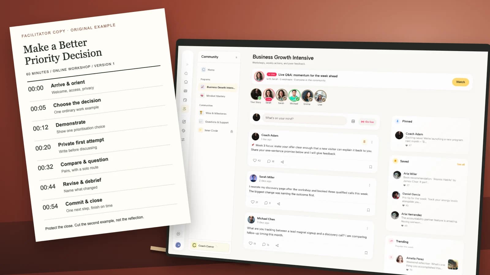
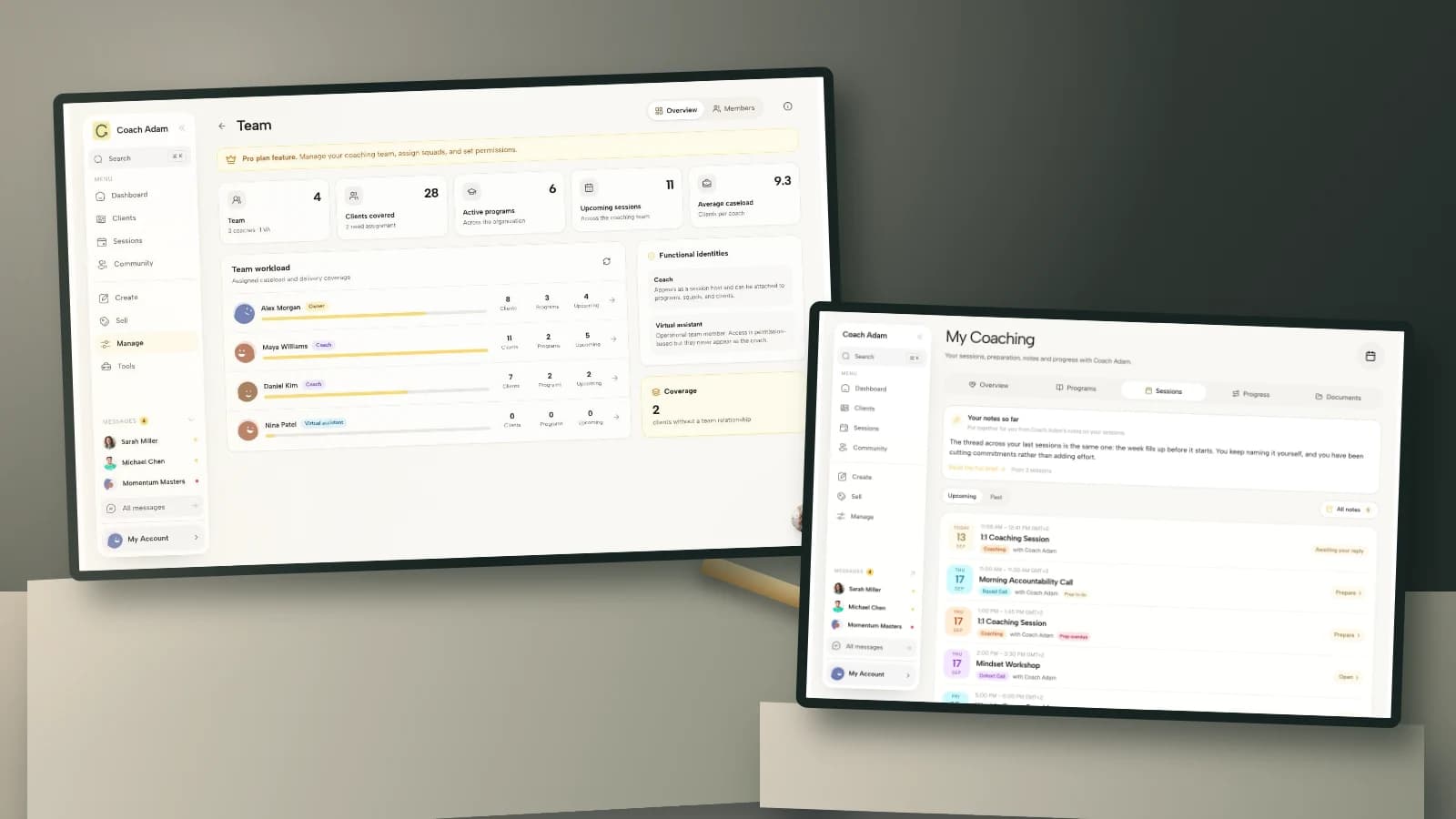
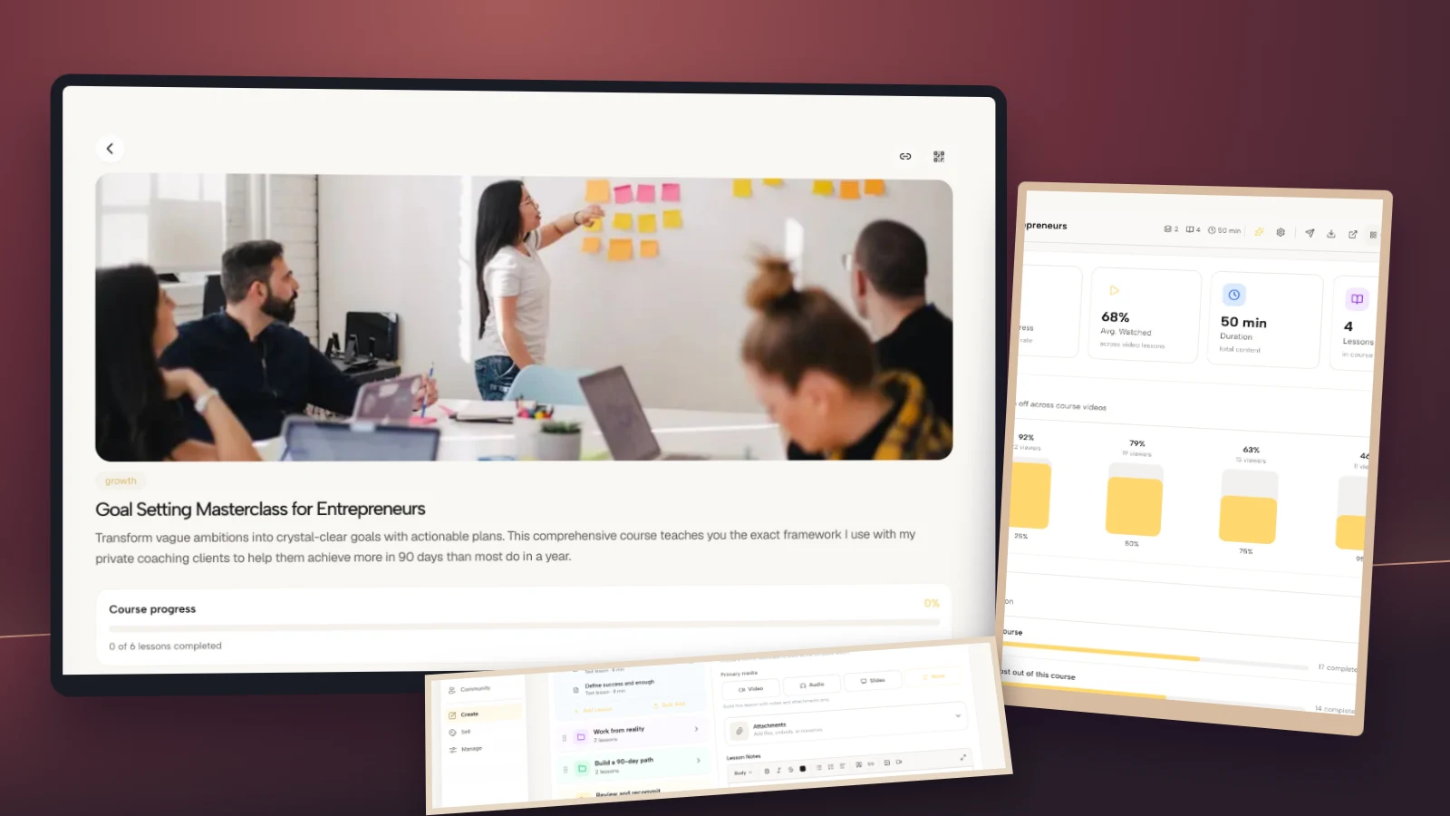
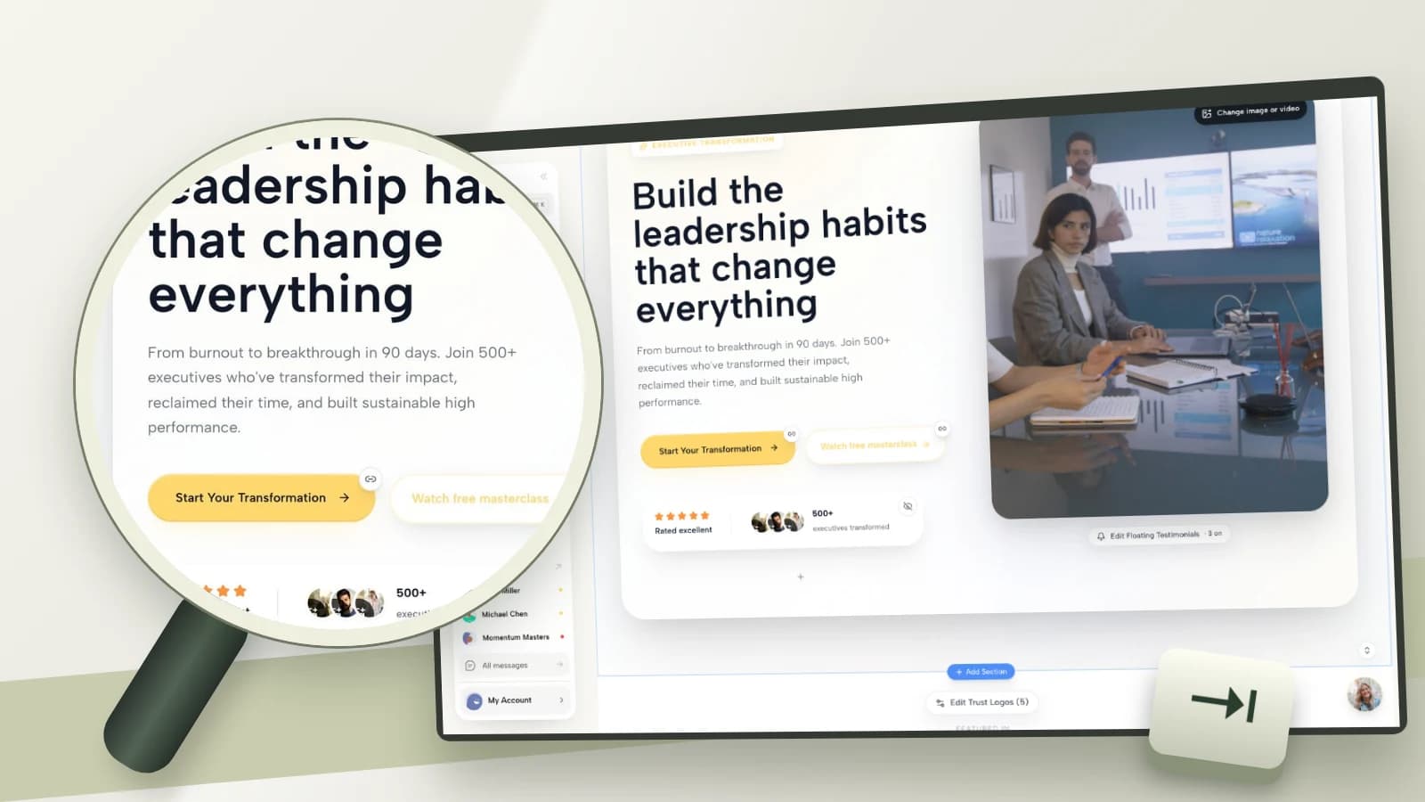
No. The real demo screenshots show the product surfaces a coach might inspect. They do not establish semantic structure, assistive-technology behavior or conformance. Your content, configuration, integrations and actual client route need their own evaluation.
Make the next action usable before sending more traffic
Choose one real consultation route and run these seven checks before promoting it again. Repair the first blocking issue, give people a usable way to contact you, and record what remains untested. The goal is not a reassuring badge. It is a person being able to take the next step.
If you are assessing how website editing, forms and client materials fit your practice, try the interactive Coachful demo. Explore the surfaces shown here, then evaluate your own published configuration. The demo is a way to inspect a possible workflow, not an accessibility certification.
Sources and related reading
- W3C WAI: Easy Checks, a first review of web accessibility. Explains both useful preliminary checks and their limitations.
- W3C: Understanding minimum contrast. Source for contrast ratios, large-text thresholds and exceptions.
- W3C: Understanding reflow. Source for the 320-CSS-pixel reference and two-dimensional-content exceptions.
- Coachful: audit your website’s offer and conversion clarity. A separate review of audience, fit, proof and the next step.
- Coachful: accessible online coaching delivery. Broader delivery choices beyond the website and booking route.